

The dashboard
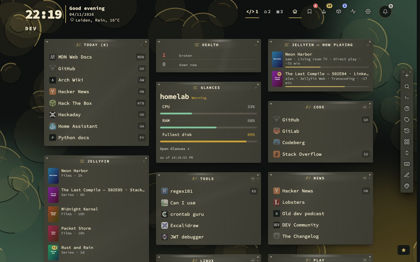
The dashboard grid is your start page: a header with clock, weather and page switcher, then categories and widgets in columns. Bookmarks, Inbox, Containers and config are icons in the header.
┌───────────────────────────────────────────────────────────────────────────┐
│ It's 09:12 · Thursday     1 2 3 +  home bookmarks inbox containers config │
│ Leiden, rain, 16°C                          page switcher, then the views │
│ Home                                                                      │
├───────────────────────────────────────────────────────────────────────────┤
│ // today (15)          // other              // weather                   │
│    bookmark rows          bookmark rows         widget                    │
│                                                                           │
│                    [ + ] [ > ]  <- action buttons                         │
└───────────────────────────────────────────────────────────────────────────┘
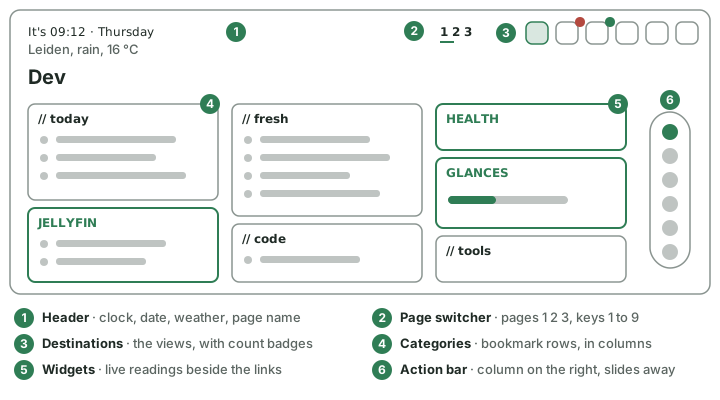
The header

The header has three zones.
- Left — clock, weather and name. The time and date, the weather line, and the name of the page or view (main, config). Click the date for a week overview; a Calendar URL (Appearance → Date & weather) adds an Open calendar link. Clock and weather chooses where they stand: beside the view name (the default), in a column of their own, or on their own line with the name underneath. A fourth placement, Large clock, greeting beside it, draws the time large with a greeting that follows the hour (Good evening, Jordi); Your name, in the Greeting group under Appearance → Date & time, is the name in it, and empty means a greeting without one. The quick start asks for the name once.
- Middle — the page switcher. See below.
- Right — the destinations. Dashboard (⌂), Bookmarks (a badge for a broken link or another problem), Inbox (an unread count), Containers (a badge for updates waiting) and config (the gear). Each destination can be switched off; its key keeps working. There is no Health icon — its badge and its list live on the Bookmarks icon now. At the far right stands the notifications bell (below).
Button style draws the header controls plain (underlined when current) or each in its own box. As the window narrows, the header folds its parts away in a fixed order, so the switcher and the destinations stay reachable.
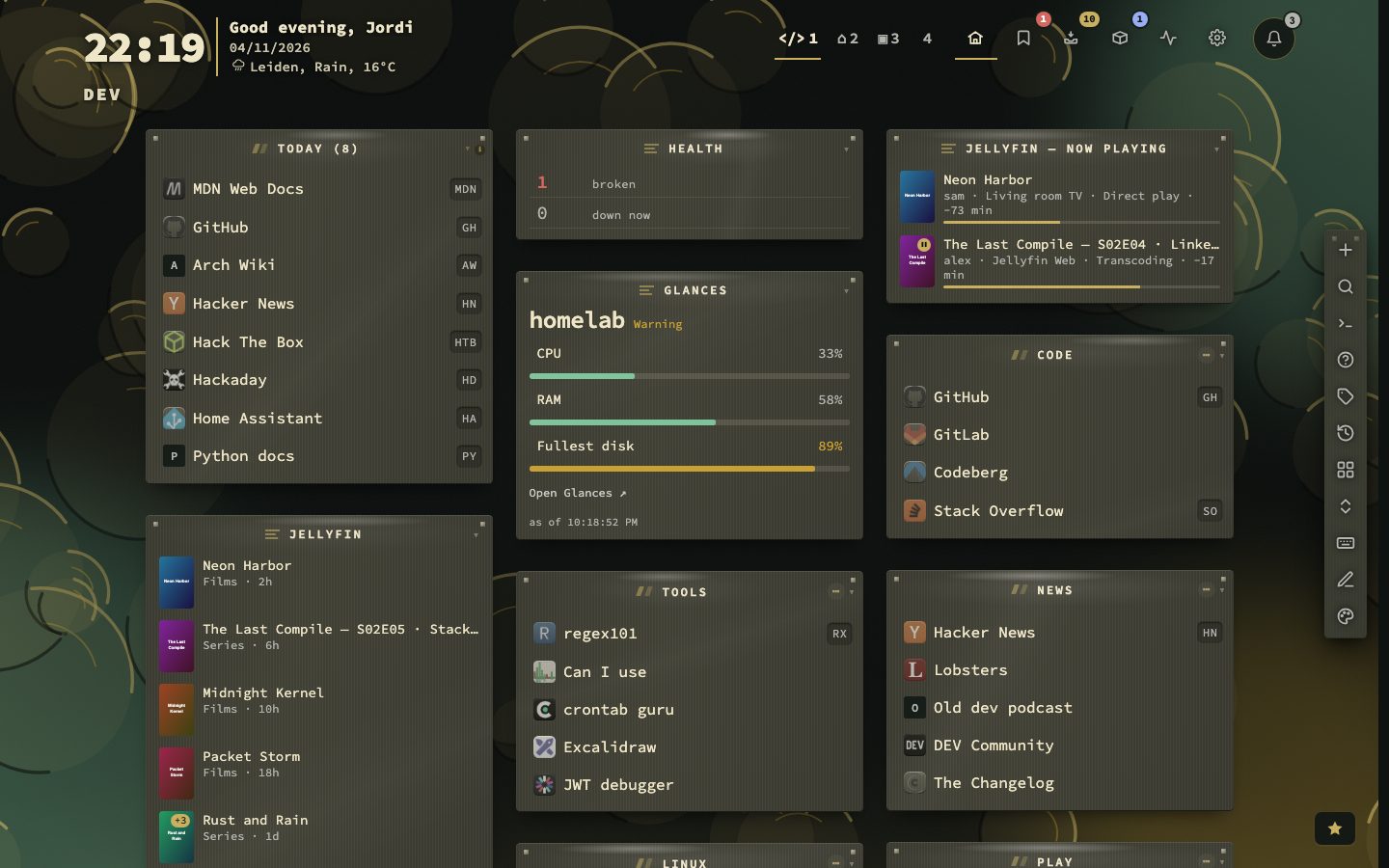
The notifications bell
What needs you waits in the bell instead of popping up over your work: questions about privacy and maintenance, urgent notices and outages, the note that an update was installed or that a new release is out, the weekly digest, a pile of kept links, and two tips a day. Rows are grouped (Health, Watch feeds, Clean up, System, Privacy, Tips), each with the button that answers it. Each row shows on its right how old it is (5 min ago, 2 days ago); the time starts over when the row gets worse, and a row that only shrinks keeps its age. New news from the feeds you watch is one row, N new from M watched feeds, that is updated in place and goes when the news is read or has expired. Mark read clears a row, No answers a question for good, and Mark all read clears the lot. A tip has a button to the place it is about: Config, the Inbox, the Bookmarks view, Containers, the tag cloud or the palette.
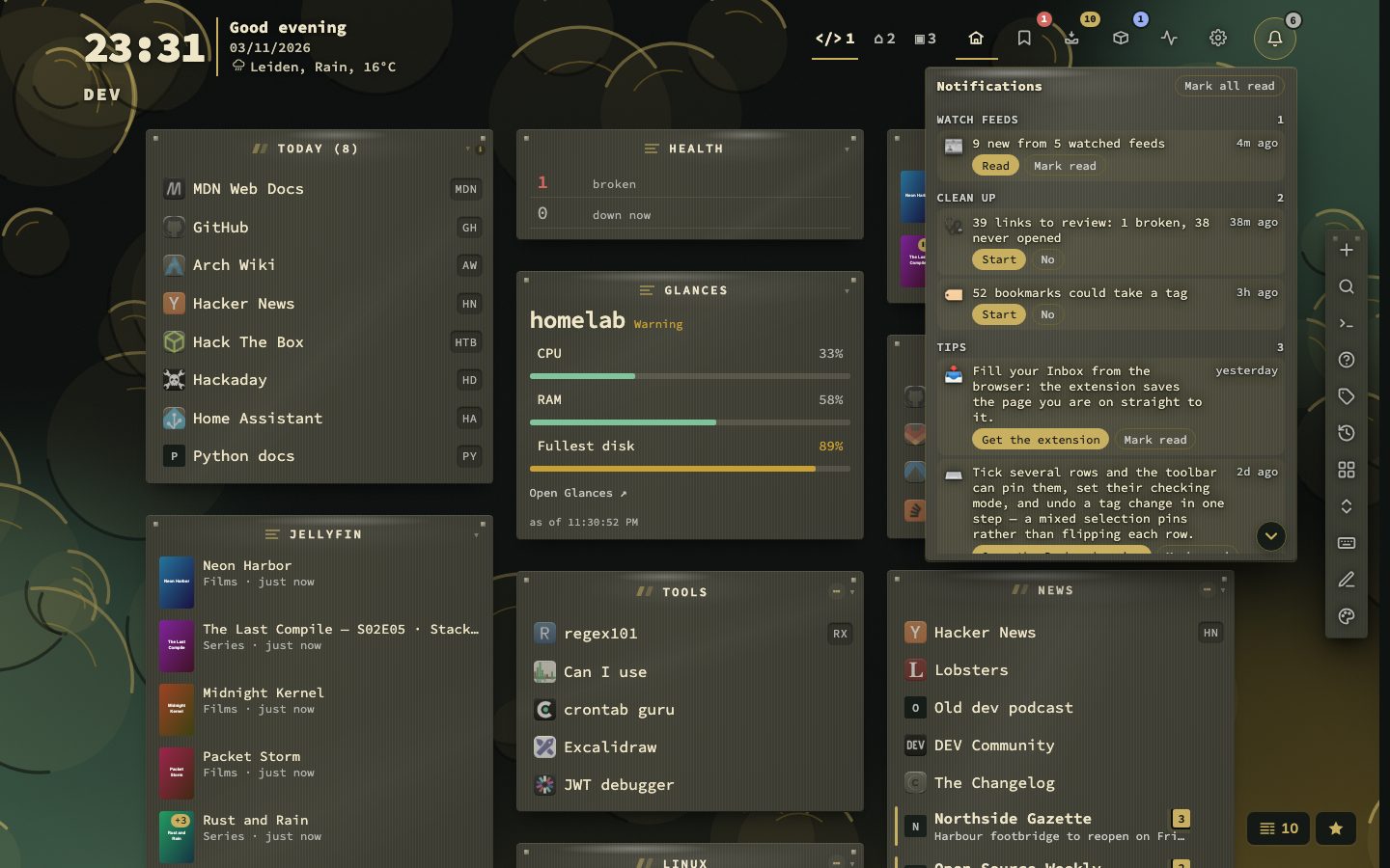
The bell shakes and pulses for something new, with a short tone (news from watched feeds has a softer two-note chime of its own); while anything is still unread the badge pulses once a minute and the bell shakes and pulses once an hour, without a tone; Bell sound for new notifications under Config → Behavior switches the tone off, and Bring back dismissed notifications there puts every answered row back.
The page switcher
| Style | What it looks like |
|---|---|
| Numbers beside the destinations (default) | 1 2 3 4 +5 |
| One segmented control | The pages as one joined control |
| Plain text, underlined | The page names as tabs |
| One button with a list | The current page, with a list of the rest |

Page tabs shown before "+N" (3–9, default 4) sets how many pages show before the rest fold into a +N list. Every page keeps its digit key. Show page names in tabs and Show the dashboard title sit in the same group. Double-click a page tab to rename it and give it an emoji and a colour dot.
:switcher, :maxtabs and :buttonstyle change these from the command palette.
The action buttons
| Button | Key | Opens |
|---|---|---|
| Add | + | The full bookmark form |
| Search | > | The search panel |
| Commands | : | The command palette |
| Finders | ? | Finders |
| Tag cloud | / | The tag cloud; pick a tag to open its tag view |
| Recent | * | Recent bookmarks — from every view |
| Pages | , | The pages panel |
| Fold all | . | Folds or unfolds every category and widget |
| Cheat sheet | ! | The cheat sheet |
| Edit | Shift + M (no bookmark selected) | Edit mode (see below) |
| Theme studio | Shift + A | The theme studio (Appearance › The theme studio); last in the bar, and left out on a phone |
Every button is on to begin with. Switch the ones you do not want off under Config → Appearance → Action bar. Hiding a button leaves its key working: + adds a bookmark, > opens search, ! the cheat sheet. With every button off, the surround disappears too.
Where the fixed buttons stand. A fresh install puts the bar in a column on the right that slides into the edge after 2 seconds, so the page has it out of the way until it is wanted.
| Position | Behaviour |
|---|---|
| In a column on the right (default) / on the left | A vertical column along that edge; the page moves aside to make room. |
| In a dock at the bottom | Centred at the bottom. |
| In the header | Beside the destinations. Action buttons shown before "+N" (default 2) folds the rest behind one control whose menu lists each action with its key. |
| Behind one menu in the header | One control; every action is in its menu. |

How it is drawn. In the new look the bar is a handle on the screen edge, drawn in the surface of the theme's material, with the mark of its head and a hairline between its groups (The new look). A docked bar stands apart from the cards it slides over: a layer of the surface colour goes over the material's paint, with an edge that leans to the accent. A button that is on is filled with the accent, as the lit view in the header is.
A bar that slides away. Slide a docked bar away after loading takes always in view, 2 (default), 5, 10 or 30 seconds, and applies to the three docked positions. The delay counts after a load and after you used the keyboard. The bar comes back when the pointer rests for a moment anywhere along that edge (or on its handle), or when focus moves into it; a quick pass on the way to the Dock or the scrollbar leaves it away. Called back with the mouse, it slides away shortly after the pointer leaves it, whatever the delay is. Brought back with ' or Shift + O it stays until you press the key again, or until the pointer has passed over it and left — from then on the delay runs as usual. Switching page or view leaves it where it is. A bar in use — the pointer over it, the keyboard in it, or a menu of its own open — never leaves while you are using it.
While it is away, a small handle stands on that edge, so the place it came from stays visible. It grows and brightens as the pointer comes near, and a click on it brings the bar back. There is no handle for a bar in the header or behind the menu, and none on a touch screen, where nothing hovers.
The keys. Show the key on each button adds a key chip to every button. It starts on for a new install and off on a dashboard that already existed — a bar of eleven chips is a lot to meet on upgrade. With the chips off, resting on a button for a moment shows that button's key beside it, so the key is still there to find.
Buttons that come into view. Animate the buttons as the bar appears is off to begin with. Its cards offer five styles: Swell (each button grows past its size and settles back, left to right), Swell from the middle, Swell together, Unfold (the bar opens and the buttons pop in) and Accordion (the bar opens from the middle and the buttons pop out to both ends). Point at a card, or move the focus to it, and its small bar plays that style; pick one and the real bar plays it at once. From then on it plays each time the bar comes into view: after a load — once no window, card or tour covers the screen — and each time it comes back from the edge it slid into. With reduced motion set in your system, the buttons simply appear.
:buttons and :maxactions change these from the command palette; :buttons theme switches the theme studio button.
The ★ button in the bottom-right corner opens the release notes. It is left out on a window as narrow as a phone; :whatsnew and Help still open them.
Edit mode
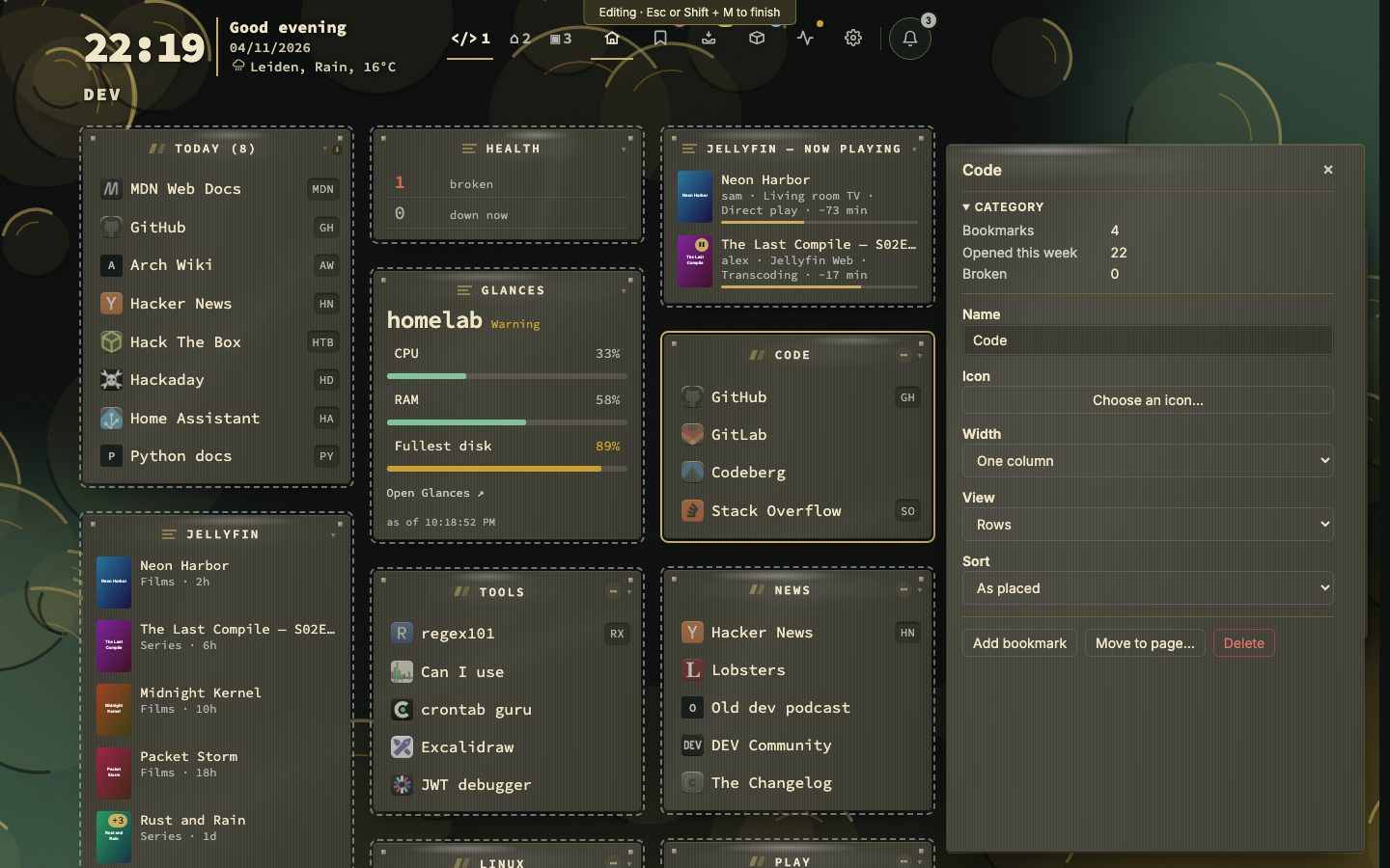
Edit mode changes the dashboard itself without a trip to Config: names, icons, widths, views, sorting and a widget's settings, all in a panel beside the page.
Switching it on. Press Shift + M when no bookmark is selected (with one selected, Shift + M still moves that bookmark), click the pencil in the action bar, type :edit mode, or pick Edit in panel… in the right-click menu of a category or widget, which also chooses that block. Esc or Shift + M switches it off. The mode is for computers and tablets with a wide window; a phone layout never enters it. Show the edit-mode button under Config → Appearance → Action bar hides the pencil; the key keeps working.
While it is on. A bar at the top says so. A click on a bookmark selects its block instead of opening it, the grid's bare letters, arrows and Enter are left alone, and the link preview card stays away and comes back afterwards if you have it on. Clicking a page tab still switches page, and the panel shows that page. Esc goes from the inside out: a dialog or menu first, then a field in the panel gives the focus back, then the mode ends.
The panel. It opens at the right when you click a block, drawn like the side panel of the views, and the grid gives way. Changes are saved as you make them; Esc in a text field puts the old text back.
| You select | The panel offers |
|---|---|
| A category | What is in it (bookmarks, opened this week, broken), then name, icon, width (one column or spread), view (rows or tiles) and sorting; buttons Add bookmark, Move to page… and Delete |
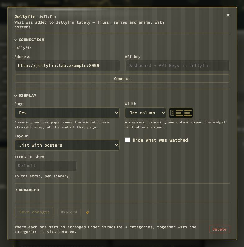
| A widget | Its type and what it shows, the main things set on it, then name, width and state; buttons Settings… (the sheet of Config → Widgets over the dashboard, with the same fields), Move to page… and Delete |
| A page | How many categories, bookmarks and widgets it has, then name, emoji and colour; buttons Add category (on the page in view) and Delete page (every page but the first) |
The buttons do what the right-click menu of the block does, with the same question before a delete. A width that cannot be chosen is greyed out and says why under the field: spreading needs a limit on items per category (Config → Appearance), at least two columns, and a layout that is not locked. A category or widget that is deleted somewhere else clears the panel, and the panel says so.
The grid

Categories and widgets stand in columns — as many as Columns per row allows and the window has room for, and one on a phone held upright. Each category header shows //, its name with an icon if you gave it one, a count, and chips for sorting (manual, A–Z, Recent), a + to add a category and a ⋯ menu. Click the header to fold the category. A spread category shows ↔ N with the number of columns it takes. Smart collections (Today, Recently opened, …) and custom collections appear as groups among your categories. A widget's header is told apart from a category's: its title sits on a lighter strip with a line under it, and its handle is a small panel where a category has // (Widgets › On the dashboard).

A bookmark row shows its icon, name, optional tags, the shortcut letters and, when checked, its status and ping. How the row looks is set under Appearance → Rows (Appearance).
A key legend under the grid shows the keys in three lines, on the dashboard view only. The keys that assume you use the keyboard appear at your first cursor move. Shift + Z switches the legend off and on, and so does Behavior → Keyboard & search. It is on for new installs.
Occasional tips. Tips do not pop up over your work. Two keyboard tips a day wait in the notifications bell (The notifications bell), a new pair each calendar day whether or not yesterday's were read, never one you have already read, each with a button to the place it is about. Show occasional keyboard tips (Behavior → Privacy & sync → Onboarding) turns them off.
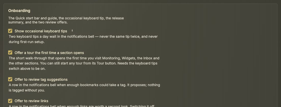
Tours on a first visit. Offer a tour the first time a section opens (the same group, on by default) decides whether Monitoring, Widgets, the Inbox, the Bookmarks view and the other sections open their tour by themselves the first time you visit. It needs the keyboard tips switch on. Switched off, every tour is still one click away on its Tour button.
Notices. What nextDash wants to offer or tell you waits as a row in the notifications bell (The notifications bell) rather than appearing over your work. In the bell, No answers an offer (it comes back only when there is more to show) and Mark read clears a tip. The few offers that need an answer on the spot, such as the apps found on your Docker host, also appear as a card in the bottom-left corner, one at a time, which can be dismissed with the ×. The theme studio hint, Updated from … to …, the Inbox extension invitation and the image-update invitation wait in the bell as well; the switches in Config still turn them off.
- Link review — 10 links to review once five or more bookmarks need a decision. Start runs a session over the worst ten (The Bookmarks view › Work through and the header band); No puts it away until more links need a decision.
- Kept links — ten or more links you kept have waited over a month in Unsorted. Open Unsorted shows them; the card never files or deletes anything.
- Tag suggestions — a round of tag review when there is something worth accepting (Tags › Tag suggestions).
- Clock and weather — asks for a town, a clock and a unit when no location is set.
- Install count — says once that the daily count of installs is on, what leaves the server, and offers Turn it off (Security and self-hosting › What nextDash contacts). It waits two days after the analytics question, so the two privacy cards never arrive in one visit.
- Moving blocks — once, a see-through copy of the first category glides to its next place to show that blocks can be moved, and a card under its
//offers Try it. The first time you pick a block up, a card beside the landing box lists the keys until Got it. - Theme studio — a row in the bell, Not happy with how it looks? Press Shift+A to open the theme studio. Shown once; a new install is shown it after its first day.
- Image updates — a row in the bell, from the third visit to the Containers view: Check images for updates? names where to switch on the daily check (Config → Containers → Updates), which sends requests to the image registries. It comes back in 30 days until you do. Nothing updates by itself (Containers › Actions and updates).
- Re-check links — Last link check was 9 days ago when the newest check is a week old or more and re-checking in the background is off. Re-check now runs the checks, Every day switches the background re-check on at 24 hours, and Not now brings it back tomorrow and Remind me in 30 days puts it away.
- Browser extension — a row in the bell, after a few visits and while nothing has ever arrived from the extension, saying the extension saves the page you are on straight to the Inbox. It comes back in two weeks (Browser extension and capture).
- Updated — a row in the bell after an upgrade, once the release notes are closed: Updated from v1.21.0 to v1.22.0. The notes are under the ★ button. It reports what happened and never asks anything; it comes once per version and not on a new install.
- Others — browser notifications, the theme studio and the tour of what moved.
Each review card has a switch under Behavior → Privacy & sync → Onboarding, the four above included (Offer image update checks, Offer to re-check links, Offer the browser extension, Show what changed after an update) and Offer to review tag suggestions. The same place lists the cards — kept links, the theme studio, tag suggestions, health review, the install count, the weekly digest and analytics — each with Answered or Not shown yet, and Show again brings an answered one back the next time its moment arrives.
The link preview card
Hovering a bookmark — or pressing Shift + V on the selected row — opens a card in a fixed order:
- What the page is — icon, title, one address and a status pill.
- What it says — image, description, publisher, author and date where the page declares them, your note and tags. A bookmark that is a video — YouTube, Vimeo, Dailymotion, or a file that ends in
.mp4— carries a small ▶ on the corner of its icon (beside the name when icons are off), and the card opens on the thumbnail with a play button over it. - What you know about it — last check and ping, uptime, certificate expiry, opens and last opened, shortcut and location.
The card is not shown in the phone layout (a window narrower than 768 px); it comes back when the window widens.
The page's picture stands on the left of the card, beside the text.
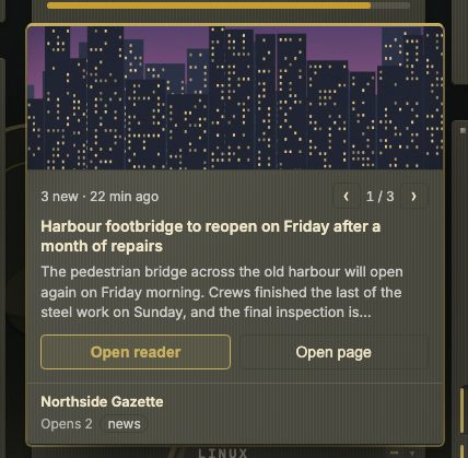
A bookmark with news (Watch feeds) gets a different card: it leads with the newest item — its photo, its headline and a short lead — with two equal buttons, Open reader and Open page (the item's own page). When the site has more than one new item, a pager (‹ 1 / 3 ›) pages through up to three. The site's own picture and description do not sit beside it, and the card is about 420 px high instead of 770.

A row with nothing to say is left out. Config → Appearance → Previews offers Off, On hover (default) and Keyboard only, a hover delay, and a checklist of rows — the player is the Video player row in that list. Shift + V works in every mode and keeps the card open with Copy, Refresh and Edit.
Playing a video. Nothing reaches YouTube or Vimeo while you hover: the poster is the picture your own server already fetched, and the player is built when you press it. From the keyboard, Shift + V puts the cursor on the play button and Enter starts it. Esc closes the card and ends the video, and so do the ✕ over the player and a click anywhere else — a click inside the player hands the keyboard to the provider, so Esc only works again once your pointer leaves the card.
The picture and the site icon are fetched by your server and stored under data/preview-images/, so hovering never tells the site you looked. The first hover shows the text at once and the picture a moment later. Untick Image and no picture is fetched or stored; set the cards to Off and nothing is fetched for them at all. Data & backups → Icons & previews caps the stored pictures at 50, 200 or 500 MB and can remove them all. Pictures are left out of backups; they are fetched again when needed.