

Appearance
Appearance changes how the dashboard looks: themes, background, surfaces, type, layout, rows, link previews, header and action bar. Pick, preview and apply, or build a theme of your own.
See them first
The theme gallery on nextdash.cc shows the dashboard in every material, dark and light, in the twelve looks, the surfaces and on every backdrop, with a search by name.
TIP
The look changed in version 1.22: every material has a surface of its own, and every install that ran an earlier release moved onto Aurora Glass once. What changed, why, and how to get your old look back is in The new look.
Config → Appearance opens straight on its settings, on the tab you had open if that was in the last five minutes, and on Theme otherwise. Nine tabs in three labelled groups:
| Group | Tabs |
|---|---|
| Look | Theme, Background, Surfaces |
| Bookmarks | Layout, Rows, Previews |
| Header & bars | Header, Action bar, Date & weather |
Each group's label stands in front of its tabs. The strip is one line from about 1440 px wide; narrower, it wraps instead of scrolling: a group that does not fit moves to the next line whole, so every tab is on screen down to phone width. Every setting is on one of them, with a short line under each saying what it does. The old names still open the right tab: a link to /#config/appearance/grid lands on Layout, …/look on Theme, and …/surface on Surfaces. Theme was called Theme & type and Previews Link previews; their addresses did not change.
Panels fold. On every tab the first panel is open and the others fold to a header with one line of their current values, changed values first. Open or fold a panel by hand and it stays that way, per tab, in this browser. The filter, Only changed, Find settings and a link such as /#config/appearance/rows/category-header open the panel they land in; Reset panel in a folded header resets it without opening it. A tab with more than three panels lists them above the preview — choosing one opens it and scrolls to it, and the panel in view is marked; under 900 px the list is left out.
Label left, control right. A setting's label and one-line explanation stand on the left and its control on the right, in one shared column. A longer explanation is cut with an ellipsis and stays whole in its tooltip and the ℹ. Under 600 px the control goes under its label.
Chips. A run of Show the … button switches is one row of chips: the action bar (eleven buttons), the header buttons, the category header extras, the row status and the date line. Each chip is still its own setting; the group has one ↺ for the chips that differ from the default and one ℹ that says what each chip does. The link preview fields and the Bookmarks view's columns and rail blocks use chips too.
The preview. Beside the settings stands a small drawing of your dashboard — header, grid, a few rows and the action dock. It follows every change as you make it, in your own theme and font, and marks the part the open tab is about: the grid on Grid, the rows on Rows, the header on Header, the clock on Date & weather, the buttons on Action bar. On a narrow window it moves above the settings.
Themes
nextDash ships 190+ theme families, each with a light and a dark half — more than 380 themes in all. A fresh install starts on Tarnished Brass — dark, with Tarnished Brass (light) for auto dark mode. (Before v1.26.0 it started on Aurora Glass.) An install that already chose a theme keeps it. It is drawn in the Signature material style (The new look), with depth, glow and effects on Follow the theme, so the theme draws itself the way it was made; ↺ beside the theme picker comes back to it. The same goes for the room between categories and between columns and for the category header. Every install that ran an earlier release moved onto Aurora Glass once, on the light or dark half it was on; a dialog says so and offers the way back (The new look › Everyone gets Aurora Glass, and the way back).
Theme on the Theme tab lists every theme by name. Beside it:
- The theme studio — Open theme studio beside the theme picker, or
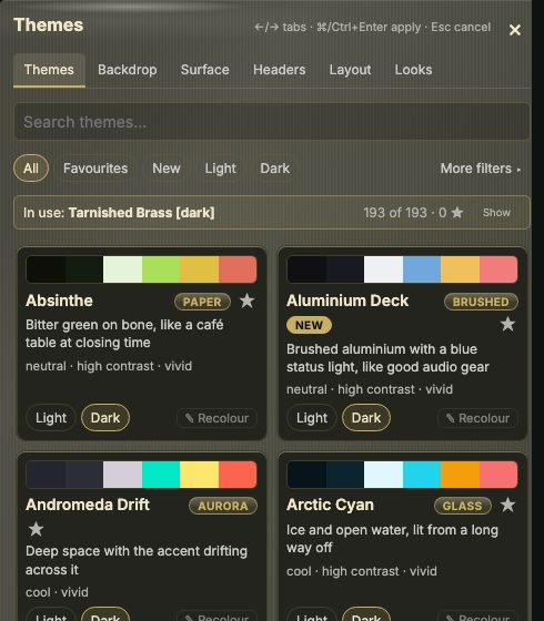
Shift + Aon the dashboard. It opens as a panel beside the dashboard, with tabs of its own (see below); the first, Themes, has one card per family, with a light/dark switch and the line that says what the theme is like to sit in front of. At the top: a search box, the segments All, Favourites, New, Light and Dark, and More filters, which unfolds the character chips (Character) and the collection chips. While it is folded, the filters that are on show as chips you can remove, and the button counts them. Light and Dark turn every card to that half; a card can still be switched by hand. Search matches a family's name, its character and the words of its line. The 62 newest families wear a new badge, and the New segment and searchingnewshow only them. Themes of your own come first, under Your themes, with a yours badge (and look when they bring one along); a segment Yours shows only them, and searchingyoursfinds them. A packaged theme you recoloured wears recoloured. A star keeps up to 24 families under Favourites. Pointing at a card previews that theme on the real dashboard; clicking one puts it on the page. A line above the grid names the theme in use — or, once you have picked another, which one is chosen and which stays until Apply — and Show brings its card into view. - Collections — the Neutrals collection holds eight grey bases on one lightness ladder — Neutral, Stone, Gray, Zinc, Slate, Chalk, Concrete and Black — each with a material and a backdrop of its own; Accent of the neutrals gives all eight one colour (Surfaces). The Looks collection holds twenty-four colour-burst families, from Ember and Supernova to Holo, built around the burst, splash and leak backdrops (Type and background). The Classic collection holds ThinkDashboard Classic, the theme of v1.0.0 with its colours and its grid of dots; the current ThinkDashboard is now ThinkDashboard Modern.
- For Unraid users — four themes after the Unraid webGUI, each in light and dark: Unraid Black (flat black panels, small uppercase labels, the orange of the logo), Unraid Azure (cool grey panels, steel-blue accent), Unraid Ember (that orange glowing out of black glass) and Unraid Blaze (the red end, hard-edged lacquer on deep crimson). All four draw card panels in the colours of a server, with a rack backdrop and terminal backdrops behind them, and a calmer band.
- Quick mode — switches between the light and dark half of the family you are on.
- Follow system dark mode — shows the light half by day and the dark half by night, following the operating system, also in a background tab.
- Random theme — Off, On page refresh, or On view change (switching between the dashboard grid, config, the inbox, the Bookmarks view, Containers or pages). Your saved theme stays underneath and comes back when you turn it off. With follow-system on, only halves that match the current mode are picked.
- Theme editor — Open the theme editor… recolours any theme, or builds one of your own (Custom themes).
:theme <name>and:darkswitch from the command palette.
The theme studio
The theme studio lies over the right of the dashboard, so every change shows on the real page while you make it. Nothing is stored until Apply; Cancel, the × at the top right, Esc or a click on the dashboard beside the panel puts everything back, in every tab. On a narrow window it becomes a sheet along the bottom.
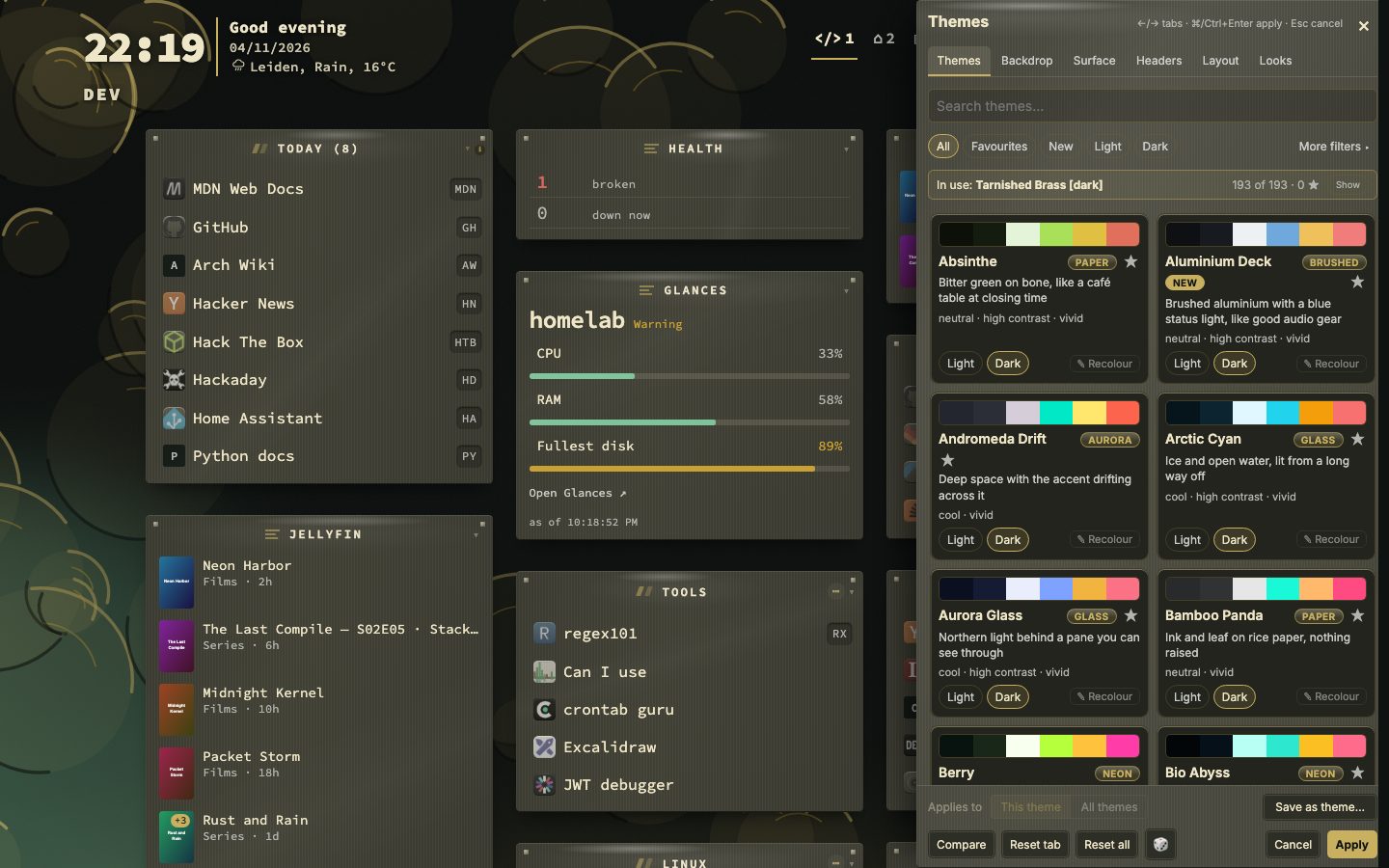
Wider. Drag the panel's left edge to widen it, or focus the edge and use ← / → (with Shift for bigger steps); a double-click gives the default width back. It never goes narrower than the default, where the six tabs fit, and always leaves 240 px of the page beside it. The width is kept per browser.
| Tab | What it changes |
|---|---|
| Themes | The theme itself (above) |
| Backdrop | Which backdrop is drawn and its settings (Type and background) |
| Surface | Depth, glow, effects and card glass (Surfaces), and the layout preset |
| Headers | How category names read above their bookmarks (Layout and rows) |
| Layout | Type, text contrast and favicon harmonization |
| Looks | Ready-made combinations of the tabs above |
- A dot on a tab marks what you changed there since opening.
- Applies to — This theme or All themes: whether the backdrop and the surface belong to the theme on screen or hold for every theme (the same switch as Use these for every theme).
- Compare shows the look from before you opened the browser until you press it again; holding
\does the same for as long as you hold it. - Reset tab undoes the open tab; 🎲 tries something at random in it. Reset all puts everything except Layout back to a fresh install's look, for every theme.
←/→move between tabs,⌘/Ctrl + Enterapplies, and Enter on a theme card picks it.- ✎ Edit on a card of your own, ✎ Recolour on a packaged one, or
eon a focused card opens the theme editor (Custom themes) in place of the grid; ← Themes goes back. The other tabs have a link ✎ Edit ‹theme› at the top. Colour changes show on the page and are kept on Apply like everything else; Cancel and Compare include them, and Reset tab in the editor puts the colours back. - Use this theme's look, above the grid, appears once a theme of your own carries a look. Off, picking such a theme leaves the look on screen as it is.
- Save as theme… turns what is on screen into a new theme of your own: a name (it suggests "‹theme› — mine"), Bring this look along, and Make the light/dark half too when the theme has two. It is saved at once and opens in the editor; picking it still waits for Apply, so Cancel keeps the new theme and puts the old one back on screen.
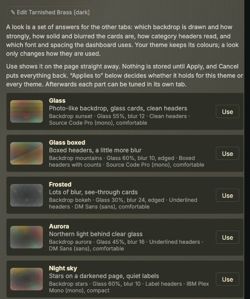
Looks set backdrop, surface, headers and type in one go, and leave the theme's colours alone. After using one, every part can still be tuned in its own tab.
| Look | What it draws |
|---|---|
| Glass | A photo-like sunset backdrop, glass cards, clean headers |
| Glass boxed | Mountains, boxed headers, a little more blur |
| Frosted | Bokeh, lots of blur, see-through cards |
| Aurora | Northern light behind clear glass |
| Night sky | Stars on a darkened page, quiet labels |
| Soft | A blurred wash of colour, calm cards |
| Desert | Warm dunes tinted by the theme, with counts |
| Paper | Contour lines and near-solid cards, accent underline |
| Blueprint | A drafting grid, edged cards, boxed headers |
| Terminal | Scanlines, solid cards, bare labels |
| Neon | Bright prisms, see-through cards, group cards |
| Plain | No backdrop, solid cards, label headers |
Themes that catch the light
How a theme catches the light is part of its character, not a group of themes of its own. The shine — a lit band across each surface and a brighter top edge — belongs to the Lacquer character; Enamel is glazed and rounder, and Neon lets the accent leave the surface as a halo. The Lacquer chip in the theme studio shows every family that shines.
Ten families still carry Gloss in their name, from when they were the only ones that shone: Gloss Obsidian, Chrome, Candy, Amber, Sapphire and Rose Gold are Lacquer; Gloss Emerald and Pearl are Enamel; Gloss Neon Tide and Ultraviolet are Neon. Searching gloss finds them by name.
The shine is drawn with the glow. When you pick a theme that shines while Glow is off, nextDash offers once to turn Glow to Soft; with Glow off, it looks matte. Effects set to Off also leaves the shine out (Surfaces).
Any theme can shine. The Gloss slider in the theme editor sets how much light a raised surface catches, for a theme of your own or a recoloured packaged one (Custom themes).
Character
Every packaged theme names one of twelve archetypes. The archetype decides what kind of surface a theme draws, which is the part a palette cannot say.
| Archetype | What it draws |
|---|---|
| Lacquer | A band of light across a polished surface |
| Glass · Frost | You look through it; frost has stopped being clear |
| Aurora | About the page behind everything, rather than the surfaces on it |
| Neon | The accent leaves the surface as a halo |
| Velvet | Deep and unlit; the light goes into the shadow beneath |
| Enamel | Round and glazed at once |
| Brushed · Carbon | A grain, in one direction or woven |
| Paper · Terminal · Ink | Matte, square-ish, and carried by the type |
The chips in the theme studio filter on it, and searching finds an archetype by name — or a word from the line each family carries.

A theme's character is editable in the theme editor, for packaged themes as well as your own: the archetype, the grain's angle and strength, the shine, the roundness, and the surfaces the theme asks to be drawn at.
Surfaces
These change how any theme is drawn. Depth, Glow, Effects, Category surface, Widget background, Widget opacity and Card glass are on the Surfaces tab; Text contrast and animations on Theme, favicon harmonization in the Favicons panel on Rows. The first four start on Follow the theme: each theme states what it was drawn for, and picking a theme brings its answer with it.
| Setting | Choices |
|---|---|
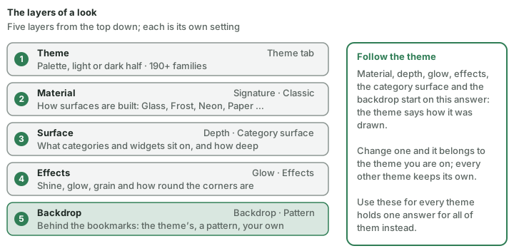
| Material style | Follow the theme (default) · Signature · Classic — Signature draws each material with a surface of its own, so glass, frost and aurora stop looking like one pane in three colours; Classic is the flat surface as it was before the new look (The new look). Follow the theme takes the install-wide answer, which is Signature unless you changed it; Signature and Classic set the theme you are on. With Use these for every theme on, the choice holds for the whole install and Follow the theme is not offered. |
| Accent of the neutrals | The theme's own (default) · Blue · Teal · Green · Amber · Rose · Violet — one colour for the eight neutral themes (Neutral, Stone, Gray, Zinc, Slate, Chalk, Concrete, Black); every colour reads on every base, light and dark. Other themes keep their own accent. |
| Depth | Follow the theme (default) · Flat · Soft · Rich · Vivid · Glass — the steps add a tint in the greys, raised surfaces and a faint wash of light behind the page; Glass blurs what is behind a surface and sits beside the ladder rather than on it. Menus are never blurred. |
| Glow | Follow the theme (default) · Off · Soft · Full — how far the theme's colour carries around a surface. Flat has no glow. |
| Effects | Follow the theme (default) · Off · Held back · Full — how loudly the character is drawn: the shine, the glow, the grain, and how round the corners are. Off leaves the palette and nothing else. |
| Category surface | Follow the theme (default) · Glass · Card · Open — what a category and a widget sit on: a see-through pane, a solid card, or nothing at all. Flat depth asks for Open. |
| Widget background | Background (default) · None — what tells a widget from a category: a title strip with a line under it, on every surface, and a card round the widget where nothing else is one (Open). None draws a widget like a category. A stored Automatic from an earlier version reads as Background. |
| Widget opacity | 0–100 % (default 50) — how solid the card and its strip are, as a share of the theme's surface colour. At 0 you see through to the page; the strip keeps a faint tint. |
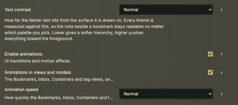
| Enable animations | On · Off — off stills the motion across the app |
| Animations in views and modals | On (default) · Off — the Bookmarks, Inbox, Containers and tag views, and the modals, rise in as they open. Enable animations off still wins. |
| Animation speed | Slow · Normal (default) · Fast — how quickly those views and modals come in. |
| Card glass | Follow the theme (default) · Own — at depth Glass, how solid the panes are (Opacity) and how far the page blurs behind them (Blur), with A thin edge round the panes if you like. Text on a pane shows the contrast that is left, and warns when it gets low. With a layout that draws no cards (Default, Compact, Masonry, List), Own gives every category a pane of its own; the Layout preset is repeated here for that reason. When the theme on screen is not at depth Glass, a button offers to switch to it. |
| Use these for every theme | Off (default), depth, glow, effects, the backdrop and the card glass belong to the theme you are on and each theme keeps its own; on, they hold across the whole install and a theme brings nothing of its own. |
| This theme | Back to the theme's own puts them back to what the theme asks for. |
| Text contrast | Soft · Normal · High · Maximum — how far the fainter text sits from its surface |
| Favicon harmonization | Off · On, with Muted, Tinted or Overlay and an intensity. Stored per theme, so the light and dark halves are set separately. |
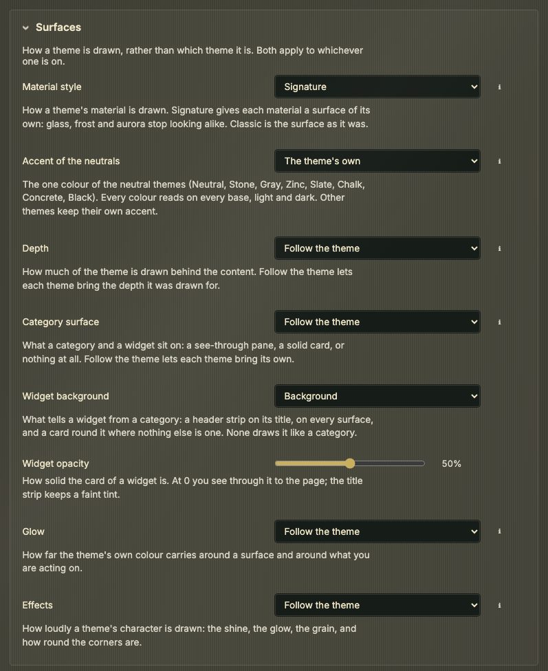
While Depth, Glow, Effects and Category surface say Follow the theme, changing one belongs to the theme on screen: switch away and back and it is still there, and every other theme keeps its own. The backdrop and the card glass work the same way.
:depth, :surface, :effects, :widgetbg, :widgetopacity, :glow, :contrast, :backdrop, :pattern and :harmonize change these from the command palette.
Type and background
- Typeface — Source Code Pro, JetBrains Mono, IBM Plex Mono, Inter, IBM Plex Sans, DM Sans or System UI — or upload a font file. The typeface you pick sets the dashboard: the header bar, the bookmark grid and the search panel. A fresh install reads in Source Code Pro there, and Inter stays one pick away. Config, the Inbox, Tags, Containers, the modals and the other views read in Inter, whatever you pick. The size is medium (M) on a fresh install. An install that has a size keeps it; one still on the old default moves up once. Code, addresses and key chips are set in Source Code Pro, or in the monospaced typeface you pick; a proportional one leaves them on Source Code Pro.
- Weight — Normal, Semi-bold or Bold. Size — seven steps from XS to XL, M by default; pointing at a size previews it.
Type is in the Type panel on the Theme tab; everything behind the bookmarks is on the Background tab, drawn in three layers from the bottom up: the theme's backdrop, a pattern over it, and a background of your own on top.
Source — Auto (follows the theme), None, Gradient or Image. Opacity (65–100%) fades it so the bookmarks stay readable. A background of your own is drawn over the theme backdrop.
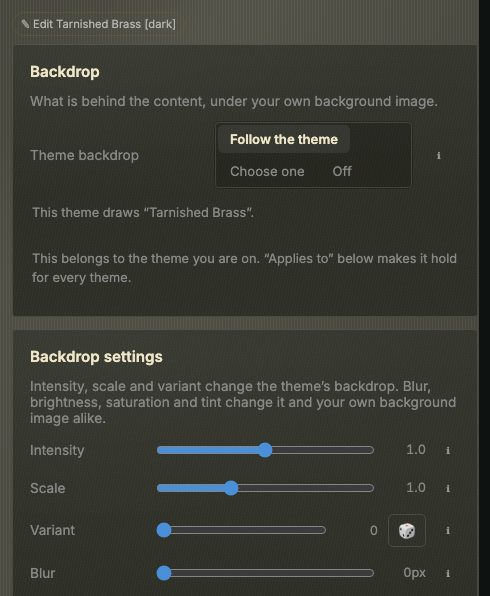
Theme backdrop — Follow the theme (default), Choose one or Off. Every theme draws a backdrop of its own, in its own colours: each theme pair, each Look and Ocean has a recipe drawn for it, and a terminal theme gets scanlines or a drafting grid, a paper theme contour lines or linen, Concrete its bricks. Each light and dark half share one. Follow the theme names the one it draws (This theme draws …), and Choose one opens the picker:
- A short view first. The theme's own backdrop (This theme), a few of the same group (Like it) and the ones you used lately (Used lately, kept in this browser only).
- All backdrops (266) opens the whole library. Chips narrow it by group, a search box looks through names and groups, and a line counts what is shown (n of 266). Hide it again with Hide all backdrops.
- Thumbnails are drawn in the colours of your theme, and only when they scroll into view, so a long list stays light on a slow machine.
The colour-burst backdrops are loud, so each is drawn over a floor of theme tint. Theme tint can raise it but never go below it.
Like depth and glow, the choice belongs to the theme you are on unless Use these for every theme is on (Surfaces).
:backdropturns it on or off from the command palette.Backdrop settings — below the backdrops in the theme studio. Intensity, Scale and Variant (with 🎲 for a new one) change the theme's backdrop; Blur, Brightness, Saturation and Theme tint soften it and your own background image alike. Quiet centre fades the backdrop toward the page colour behind your bookmarks, so a pattern or a scene stays at the edges of the window and out of the way of the text; at 0 the backdrop is drawn edge to edge, and the value is kept per theme, with the install-wide number as the fallback. Only the backdrop blurs, never the bookmarks. Back to the defaults resets all eight.
Pattern over it — Follow the theme, Dots, Grid, Lines, Hatch or None: a texture drawn over the backdrop. Left to the theme, there is none while a backdrop is shown; with the backdrop off, most themes ask for dots.
Custom themes
Open the theme editor… on the Theme tab opens the editor as a page of its own; the back link above it returns to Theme. A link to /#config/appearance/custom-themes opens it directly.
- Your themes — Add custom theme, edit, reorder (↑ ↓), delete, ⤓ export to a JSON file, and Import theme…. A theme you make appears in the theme list beside the packaged ones.
- A custom theme can set everything a packaged theme can: its colours, and under Shape & character its character, corner roundness, surface opacity, blur, glow, the Gloss slider (how much light a surface catches), the grain's direction and strength, the category titles, the backdrop — Automatic or any of the 75 backdrops, shown as tiles in the theme's own colours — and the depth and effects it asks to be drawn at. It has a light and a dark half, like the built-in themes.
- This theme's look (in the theme studio's editor) — a theme of your own can bring a look along: backdrop and its sliders, card glass, depth, headers, type and spacing. Take the look on screen stores what you see, Clear removes it, and both halves of a pair share it. Picking the theme — a card, the Theme picker or
:theme— applies the look; switching halves with Quick mode or the system's dark mode does not, and neither does Random theme. A theme file carries its look. - In the Theme picker your themes come first, in a group of their own, and the closed picker says · yours; a recoloured packaged theme says · recoloured.
- A contrast check warns when text is too faint against its background.
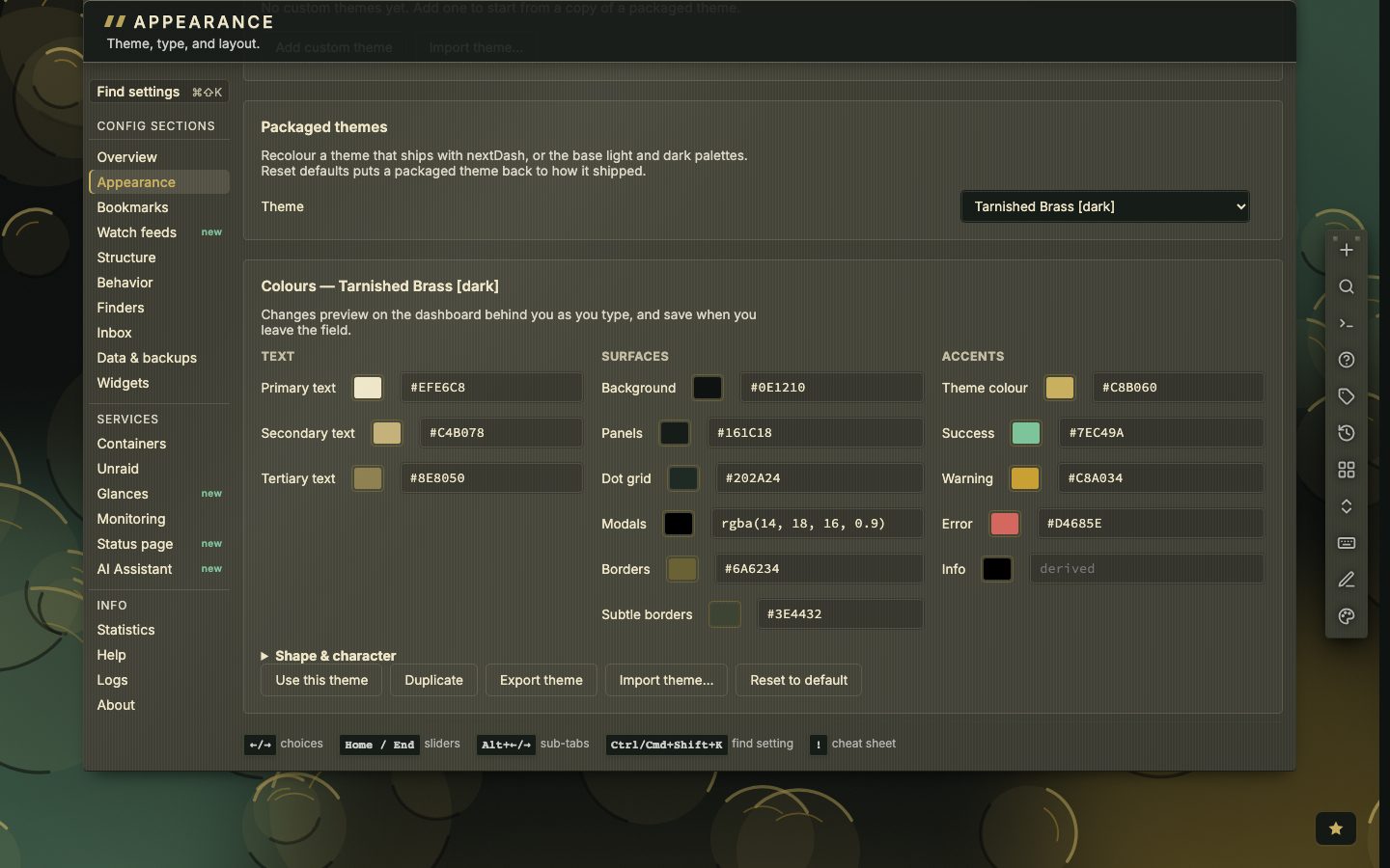
- Packaged themes — recolour any theme that ships, or the base light and dark palettes. Reset defaults puts a theme back.
- Changes preview live on the dashboard behind config; leaving the tab drops an unsaved preview. On a phone the editor is read-only.
📷 Screenshot — the theme editor
Layout and rows
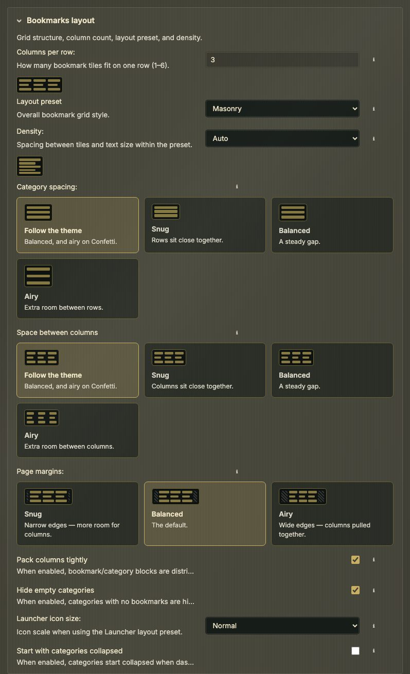
Layout tab — panels Bookmarks layout and Categories across columns.
| Setting | What it does |
|---|---|
| Columns per row | 1–6 — the most the grid uses. A narrower window takes as many as fit, and one only when two no longer fit; a phone held upright always shows one |
| Layout preset | Default, Compact, Cards, Terminal-ish, Masonry (default on a fresh install), List, Widgets and Launcher (large icon tiles) |
| Density | Comfortable, Compact, Dense or Auto (default on a fresh install) — one setting for the dashboard, the inbox and the Containers view; the Bookmarks view has its own row height (Config › Config → Bookmarks) |
| Space between categories | Follow the theme (default; balanced, and Airy on Confetti) · Snug · Balanced · Airy — the gap down the page, between rows of categories |
| Space between columns | Follow the theme (default; balanced, and Airy on Confetti) · Snug (12 px) · Balanced (24 px) · Airy (40 px) — the gap across the page, between one column and the next. :columngap sets it from the palette, and the theme studio has it on its Layout tab |
| Page margins | Snug · Balanced (default) · Airy — the empty band left and right; Snug lets the columns grow wider into it, Airy pulls them together |
| Pack columns tightly | Categories fill the columns without waiting for a full row |
| Hide empty categories | |
| Launcher icon size | Small, Normal or Large, for the Launcher preset |
| Start with categories collapsed | Every category starts folded |
| Items per category | 10–50 or Unlimited: how many bookmarks show before + N more. Unlimited is not available while a category spreads |
| New categories spread across columns | On by default. Only for categories made from now on (Pages, categories and collections › Spreading a category across columns) |
| Turning spreading off covers | The current page or every page — what Turn off acts on; it puts every category back to one column |
Small drawings beside the shape settings show what a value looks like.
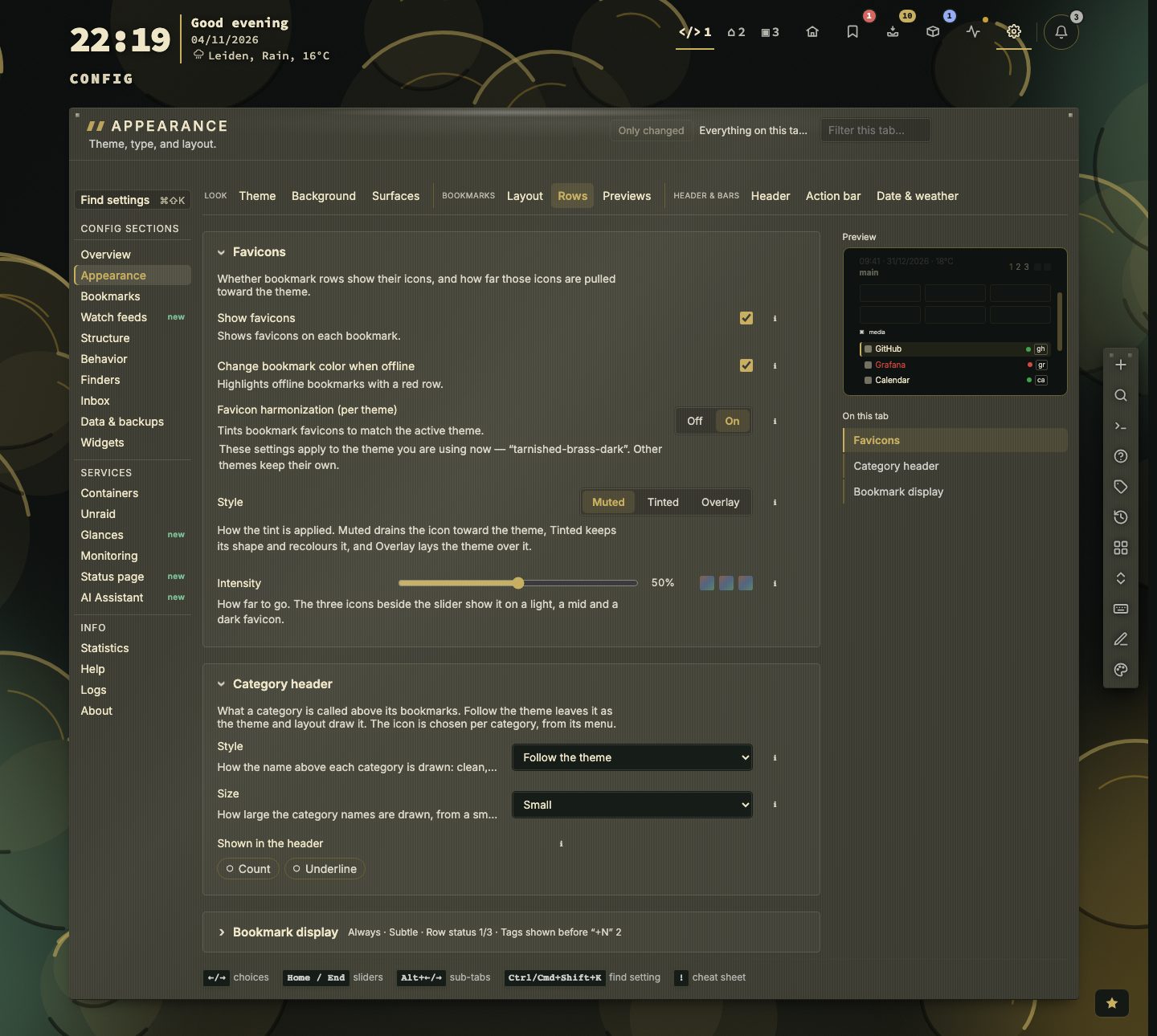
Rows tab — panels Favicons, Category header and Bookmark display. The first two lines are the Favicons panel; Favicon harmonization (Muted, Tinted or Overlay, with an intensity, stored per theme) is in it too.
| Setting | What it does |
|---|---|
| Show favicons | Bookmark icons on or off. With icons on, a video's ▶ sits on the corner of its icon; with them off, beside the name |
| Change bookmark color when offline | A broken row takes the status colour |
| Shortcut letters on rows | Always (default; a column down the right of each category) · Only on the row you are on · Never — the shortcuts keep working in every mode |
| How a row lights up | Subtle (default) or Strong — how far the accent carries across the row you are on |
| Row status | Chips for the online/offline status colours, a loading state while checking and ping times. A new install starts with Online/offline on and the other two off; an install that already has these settings keeps them |
| Show tags on bookmark rows | And Tags shown before "+N" |
| Category header | How a category's name reads above its bookmarks. Style: Follow the theme (default), Clean, Underlined (optionally in the accent colour), Boxed, Label or Group card, which wraps the category and its bookmarks in one pane. Size: Small (default), Medium or Large; an install that was still on Medium moves to Small once. Shown in the header — chips for the category icon (chosen per category, from its menu), the count of bookmarks on the right, and the underline |
Previews tab — one panel, Link preview cards: Off · On hover (default) · Keyboard only, a hover delay (Fast, Balanced, Calm) and What the card shows, as chips: image, site, author & date, video player, description, your note, tags, status & uptime, opens, shortcut & location (The dashboard).
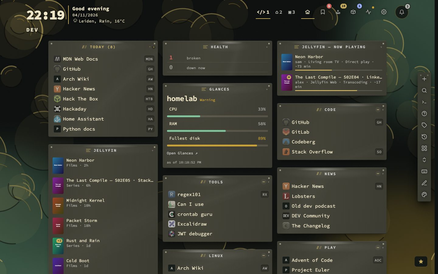
📷 Screenshot — the Compact layout preset at Dense density, full page
Header and action buttons
See The dashboard for what each part does. The settings:
- Header tab, panels Header and Browser tab & branding — button style (plain or boxed), page tabs on/off, page names in tabs, page switcher style, page tabs before +N, the dashboard title, and chips for the dashboard, inbox, config and Bookmarks-view buttons. The browser tab sits in the second panel: the page name in the browser title, a custom title and the favicon upload, also used when nextDash is installed as an app. Where the clock and weather stand is set on Date & weather (Date and weather).
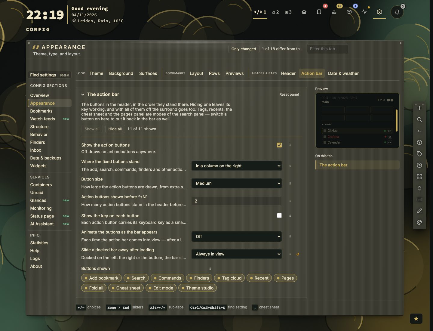
- Action bar tab — Show the action buttons leads, since it decides whether the rest matters; then where the fixed buttons stand (a column on the right by default), Button size (extra small to extra large; medium by default, one step up from the 28 px squares the bar had, which are now small), action buttons before +N, show the key on each button (off for new installs), slide a docked bar away after loading (2 seconds by default), how the buttons come into view each time the bar appears (off by default; a dropdown — picking a style plays it on the real bar at once), and one chip per button. See The dashboard for what sliding away looks like and how the bar comes back.
Each chip group has Show all / Hide all.
Date and weather
- Clock & weather — leads the tab: where they stand — beside the view name, in a column of their own, or on their own line.
- Date & time — show date, show time (chips), date format, 12- or 24-hour clock.
- Weather — on or off, Location source (a city you type in Weather location, or Automatic (by IP)), Celsius or Fahrenheit, refresh interval. The Weather widget reads the same settings, and with Fahrenheit the Glances page writes its temperatures in °F too.
- Calendar — Calendar URL (the link in the date popover) and Calendar feed URL (.ics) (what the Calendar widget reads).
Finding and resetting
Each tab has a filter beside Only changed. When the filter — or Only changed — finds something on another tab too, the line under the list names that tab with a count (Also found on: Header 2); a click opens it and keeps the filter. A match inside a folded panel — or on one chip — opens that panel. ↺ resets one setting, Reset panel a whole group. Ctrl/Cmd + Shift + K finds any setting (Config).