Theme studio
since v1.4 · 27 Aug
Try 384 themes live on your own dashboard.
- ShiftA Open the theme browser
- ←/→ Switch tabs
- Enter Choose a theme
- e Edit or recolour the focused theme
- \ Hold to compare
- Ctrl/CmdEnter Apply
- Esc Cancel
The theme studio is a panel beside your dashboard, so every change shows on the real page while you make it. It holds 192 theme families, each in light and dark, with twelve materials, 266 backdrops and twelve ready-made looks. A new install starts on Tarnished Brass. Nothing is stored until you press Apply.
Search by name, character or mood, keep favourites, and point at a card to preview that theme at once. Hold the backslash key to compare with what you had.
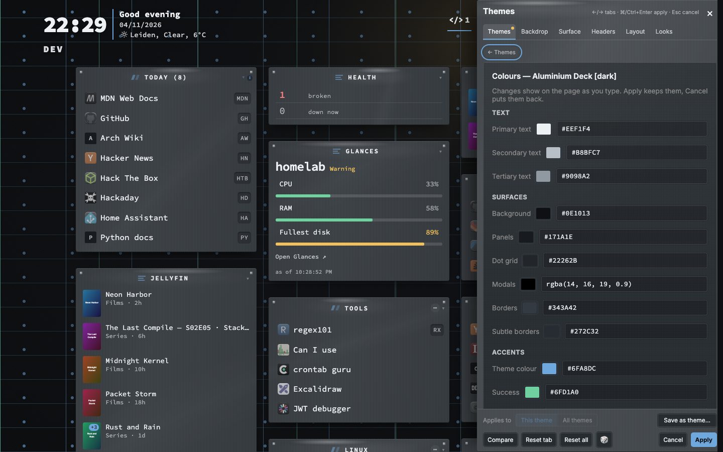
The theme editor is built in. Recolour any theme, or build one of your own. Save what is on screen as a theme with Save as theme, and it joins your own themes at the top of the list.
Try it
- Press Shift + A on the dashboard.
- Move over the cards and watch the page change.
- Press e on a card to recolour it, then Apply, or Esc to put everything back.
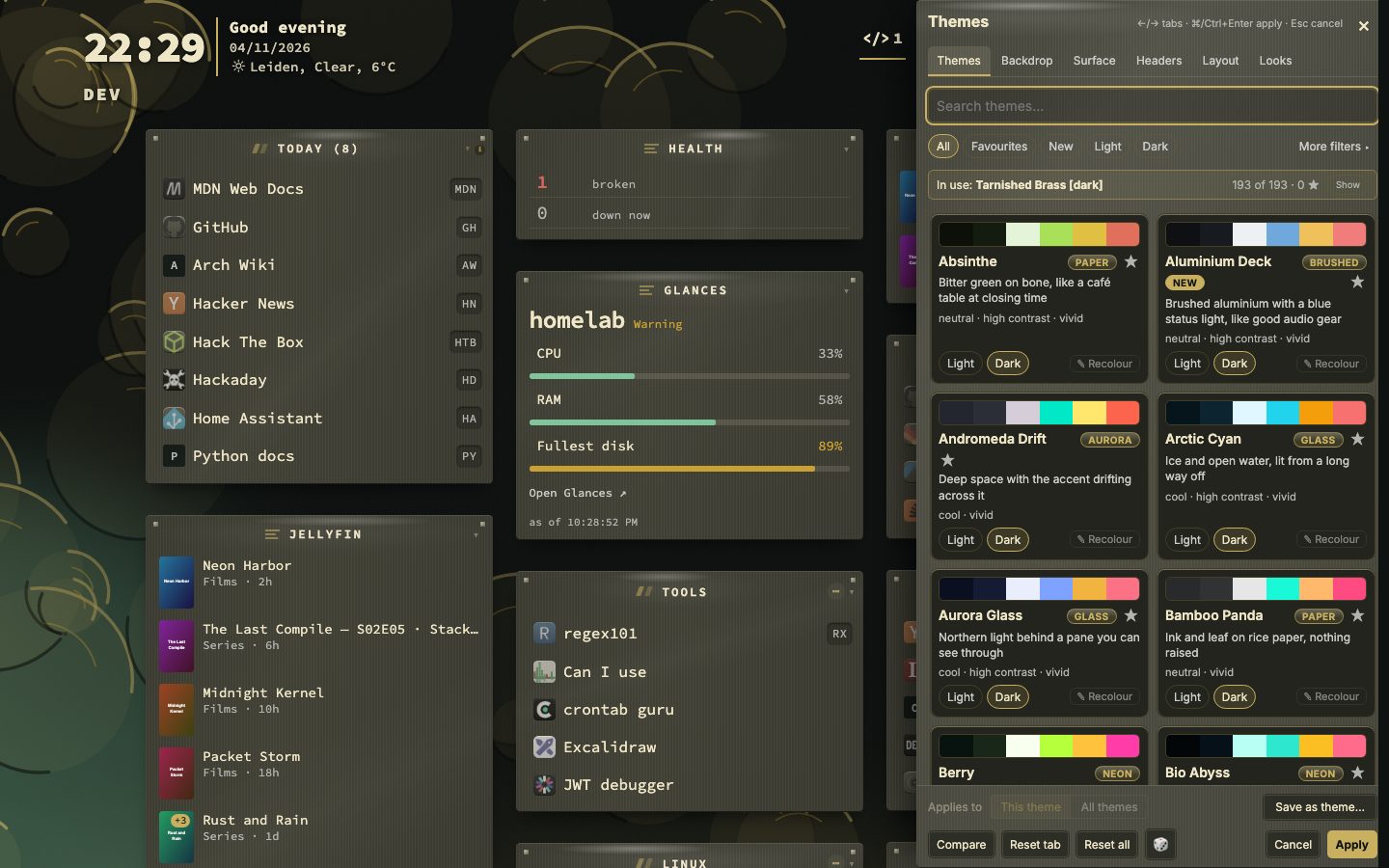
More filters
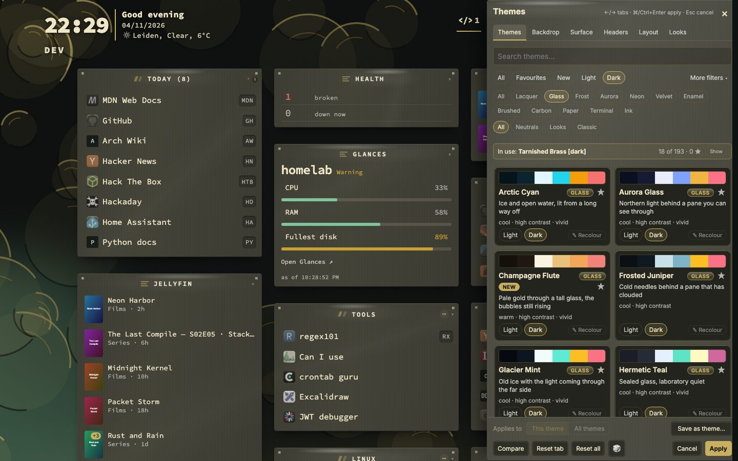
More filters opens extra ways to narrow the grid, and Reset all clears every filter at once, so you can go back to the whole collection in one click.
Aurora Glass, and the way back
A new install starts on Tarnished Brass: a dark, brushed metal with brass for the accents. Before v1.26.0 it started on Aurora Glass: northern light behind a pane you can see through. With v1.22.0 every install that already existed moved onto Aurora Glass once, on the dark or light half it was on, and a dialog showed the theme it had before. Bookmarks, categories, settings and your own themes stayed as they were. The dialog offers Go back to the earlier theme and a way into the theme studio, and the theme studio can always put any theme back.
Two ways to draw a material
Each of the twelve materials draws its own surface, category header and widget header: paper reads as an index card, enamel as a glazed tile, neon has a glowing top edge, brushed metal and glass carry a shine. Material style in the Surface panel keeps that signature drawing, or turns it into Classic, the flat surface of before.
Backdrops, neutrals and Classic
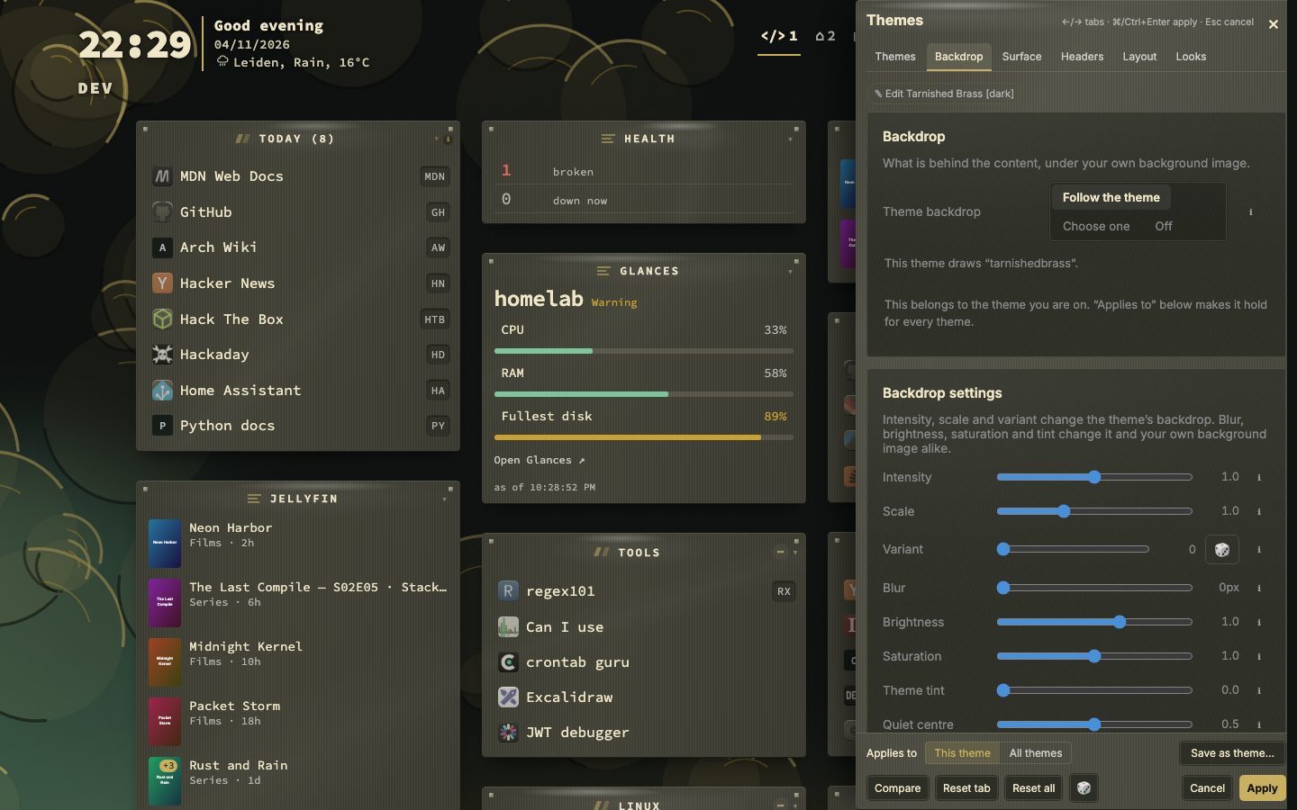
There are 266 backdrops. The first 75 are shared: every material has a pool of its own, and a theme picks from the pool of its material. The rest are drawn for one theme pair, a Look or Ocean each, in that theme’s colours, so a theme comes with a backdrop that fits. A Quiet centre slider fades the backdrop behind the bookmarks. The eight neutral themes (Neutral, Stone, Gray, Zinc, Slate, Chalk, Concrete and Black) sit on one lightness ladder, with an accent you pick once for all of them. ThinkDashboard Classic brings back the first page nextDash ever drew, flat, with a grid of dots, in a collection of its own.
A backdrop for every theme
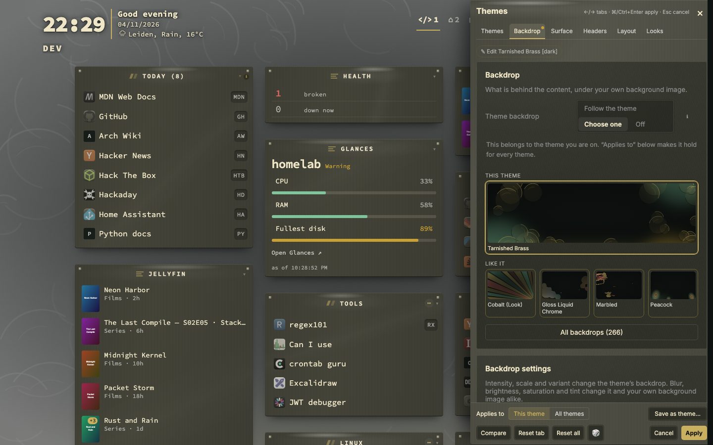
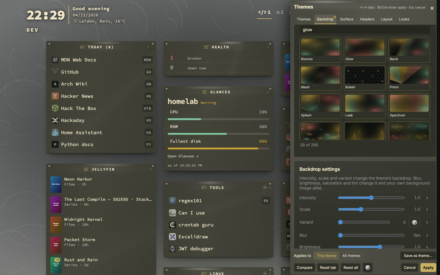
Every theme family has a backdrop recipe of its own, drawn in the theme’s colours. The picker starts short: the theme’s own backdrop, a few like it and the ones you used lately. All backdrops opens the whole library with groups and a search, and the backdrop settings sit with the backdrops in the studio.
Inside the theme studio
- 266backdrops
- 75shared backdrops
- 12looks
- 12characters
The studio lies over the right of the dashboard and has six tabs: Themes, Backdrop, Surface, Headers, Layout and Looks. A dot on a tab marks what you changed there since you opened it. Drag the left edge of the panel to make it wider, and double-click the edge to get the default width back. On a narrow window it becomes a sheet along the bottom.
- Applies to says whether the backdrop and the surface belong to This theme or hold for All themes.
- Compare shows what you had before you opened the studio. Holding the backslash key does the same for as long as you hold it.
- Reset tab undoes the open tab, and Reset all puts everything except Layout back to a fresh install.
- The left and right arrow keys move between tabs, and Ctrl or Cmd + Enter applies.
- 1Press Shift + A on the dashboard
- 2Point at a card to preview that theme
- 3Open the Backdrop tab and pick a backdrop
- 4Use Compare to check against what you had
- 5Press Apply to keep it, or Esc to put everything back
You can also change a theme from the command palette: :theme followed by a name.
Twelve characters
Every packaged theme names one of twelve characters. The character decides what kind of surface the theme draws, which a palette alone cannot say. Lacquer is a band of light across a polished surface. Glass and Frost are panes you look through, and frost has stopped being clear. Aurora works on the page behind everything. Neon lets the accent leave the surface as a halo. Velvet is deep and unlit. Enamel is round and glazed. Brushed and Carbon carry a grain, in one direction or woven. Paper, Terminal and Ink are matte and carried by the type.
The character chips under More filters narrow the grid to one character, and a search finds a character by its name. In the theme editor the character of a theme can be changed, for packaged themes too.
Depth, glow and effects
On the Surface tab, Depth is Follow the theme, Flat, Soft, Rich, Vivid or Glass. Glow is Follow the theme, Off, Soft or Full, and says how far the colour of the theme carries around a surface. Effects says how loudly the character is drawn: the shine, the glow, the grain and how round the corners are. Off leaves the palette and nothing else. While a setting says Follow the theme, a change belongs to the theme on screen and every other theme keeps its own. Use these for every theme makes one answer hold for the whole install.