Bookmarks have been draggable in nextDash for a long time, but the blocks they live in — categories, widgets, smart collections — could only be nudged one place at a time, and never off the page they were on. v1.18.0 fixes that. Structure, the theme browser and the What’s new window got a pass while I was in there.
Moving a block, with a landing box
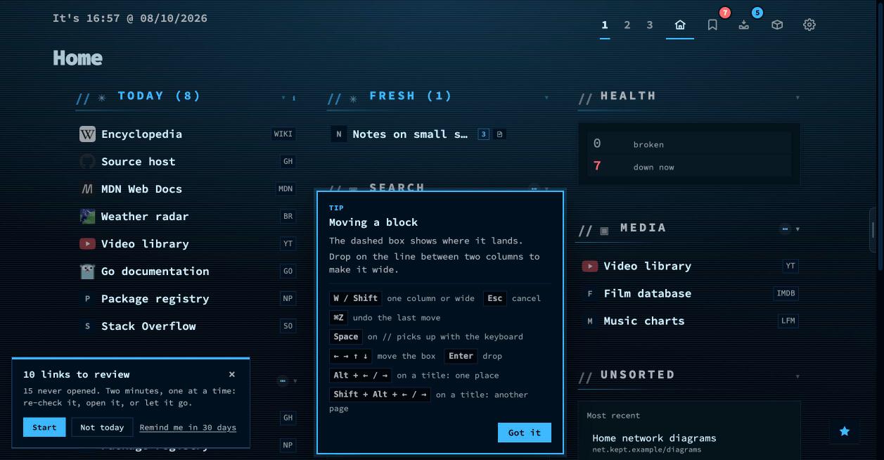
Drag the // in front of any category, widget or collection title. The page holds still — nothing reflows under your pointer — and a dashed box shows where the block will land, with a label saying it in words: after Media · 2 columns. Drop on the line between two columns to make it wide; W or Shift switches while you drag.
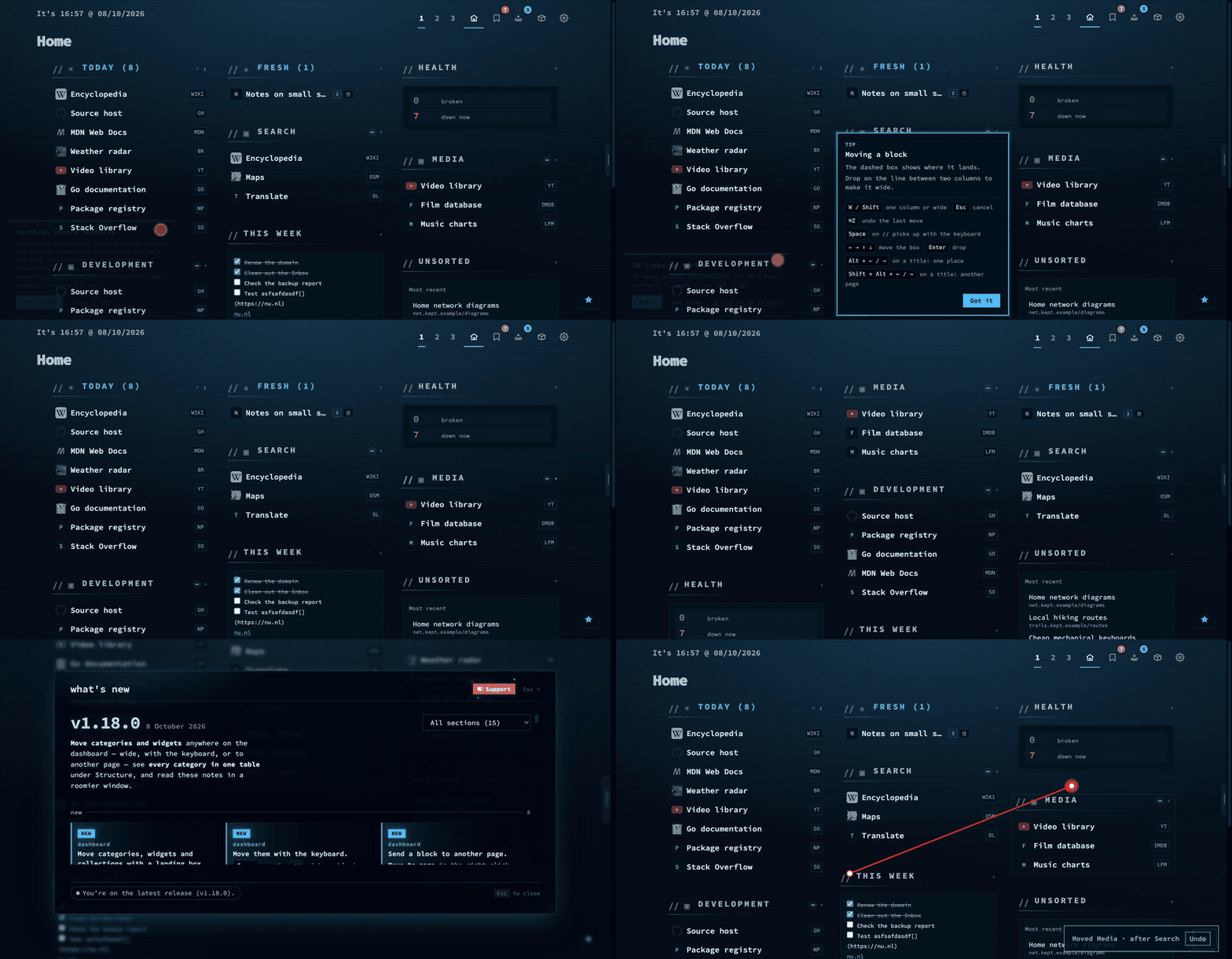
//, drop it where you want it. Undo is on the notice.Categories, widgets and collections now share one code path and one order, which was the long part — and it flushed out a bug worth admitting to. A collection’s id was dropped from the saved block order unless it was a category or a widget, so a collection you moved in among your categories jumped back to the end after a reload, and one you had made two columns wide came back narrow. Ids, widths and page lists all survive the save now.
The keyboard does all of it
Space on the // picks a block up. The arrows move the landing box a place sideways or a row up or down, W switches one column and wide, Enter drops and Esc cancels. Every step is announced, so this works with a screen reader rather than in spite of one. Alt + ←/→ on a title still shifts a block one place.
To another page
Move to page ▸ sits in the right-click menu of a category, widget or collection; Shift + Alt + ←/→ does the same from a title. The block lands at the end of that page, and a category takes its bookmarks along — if some already live there, only the rest move and the notice says the category is on both pages now. Tag collections are not offered: they appear wherever their tag does.
Every move has Undo on its notice, and Ctrl/Cmd + Z does the same while it is up — within a page or across them. Lock layout blocks the lot, and says where to switch it off.
Every category in one table
Structure → Categories showed one page at a time. It is now a single table of every category you own, grouped by page, each group foldable. Chips narrow it to certain pages or to a view — spread, with broken links, empty — and the sort gained Most bookmarks and Most broken, which is how you find the category that needs an afternoon.
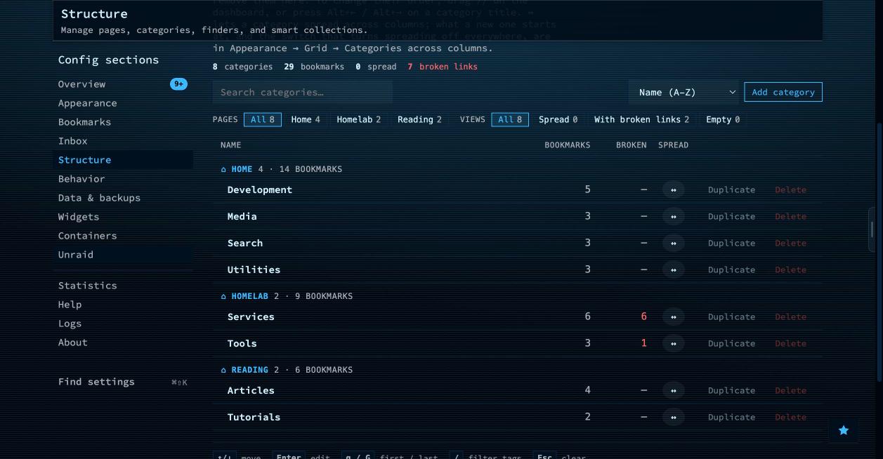
The move buttons are gone from those rows: order is set on the dashboard now, and two places to do one thing is one too many. Pages, Finders and Collections took the same list look while I was there. One default changed with it — new categories spread across columns from the start, under Appearance → Grid. A stored false stays false.
Themes: Reset all, and fewer filters
Reset all, beside Reset tab in the look studio, puts backdrop, surface, headers and looks back to what a fresh install has — for every theme, not only the one you are on. Your theme and your Layout stay. The defaults come from the server, so the client never guesses them.
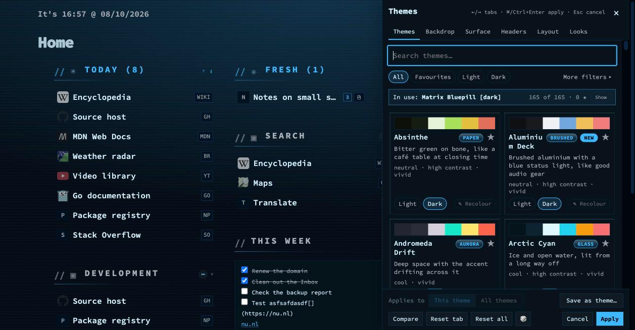
The filter row had grown long, so the character and collection chips fold under More filters; folded, whatever is on shows as chips you can remove and the button counts them. And a small fix with a long cause: with always show scrollbars on, every dark theme had a white strip down the right edge. --hairline-strong lives on body, but the page scrollbar is styled from html, where that property was never valid.
A roomier What’s new
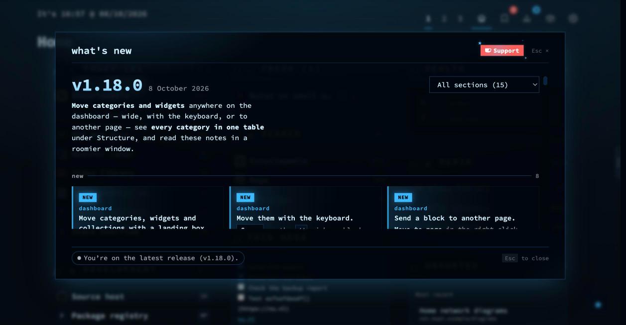
The window you are probably reading these notes in is wider and taller, and a release reads as a digest: new things first as cards, fixes after them as one line each with the reasoning behind a disclosure, shortcuts in their own group. The row of tabs that ran off the right edge is one section menu now.
Smaller changes
- The header band in the bookmarks view is see-through at rest and nearly solid once you scroll, so rows no longer ghost through it.
- Browser extension: a first setup lists your pages and categories straight after Save Settings; a second quick save keeps its badge mark; icons are drawn at their real sizes; and you get a proper message when the browser has not granted access to your nextDash address.
- The Spread column in Structure grows to fit its heading, so the Dutch Uitgespreid no longer runs into the next one.
The last few weeks
Coming from further back, this is roughly what you missed. v1.16.0 turned the theme browser into a look studio — a panel beside the dashboard whose tabs change the theme, its backdrop, the card glass and the type live, with nothing stored until Apply. Backdrops went from 9 to 26.
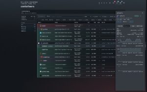
v1.17.0 was the big one: real app icons for containers and self-hosted bookmarks from dashboard-icons and selfh.st/icons, fetched by the server so your browser never talks to a CDN; alerts through Apprise, and with it mail, Matrix, Signal and a hundred more; seven Unraid widgets reading array, parity, shares, VMs and UPS; web search through your own SearXNG or the Brave API; and a bug hunt that closed 81 bugs, each with a test that fails without its fix.
v1.17.2 added a Notes widget with Markdown and checkboxes, pages you can share as template files, and quiet hours for alerts. v1.17.5 gave Config → Overview a panel naming the version you are running, with a dot that says whether it is the newest, and taught the update check to wait out GitHub’s hourly limit instead of failing silently.
Upgrading
docker pull ghcr.io/jordibrouwer/nextdash:latest
# or
docker pull foobar1452/nextdash:latest
Unraid users: update the container from the Docker tab. No configuration changes are needed.
Full notes are in the changelog; the source is at github.com/jordibrouwer/nextdash.