The last update version v.1.4.2.4 was the one where the dashboard stopped being only links: widgets in the grid, copies of pages kept where you can still read them, a theme browser instead of a listbox. This one is the half that comes after — making all of that behave like the parts that were already there.
Nothing here changes what nextDash is. It is the round where a widget starts answering to the right-click and the keyboard the way a category always has, where Health can be told to stop reporting a condition you have already judged, where an Inbox backlog can actually be cleared, and where the browser’s Back button — which had never worked at all — takes you back.
Source and downloads: github.com/jordibrouwer/nextdash — release notes: on GitHub
Widgets stopped being decorations
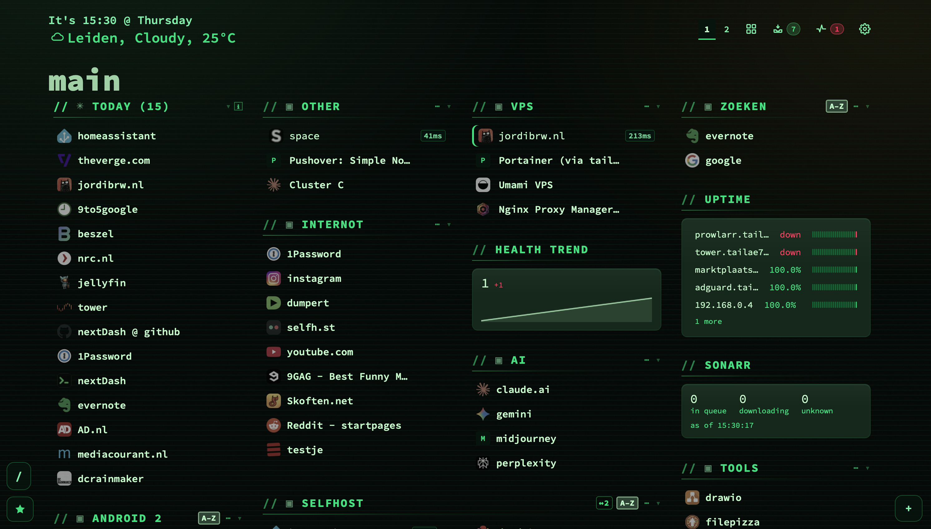
Widgets arrived as blocks you arranged in config. On the dashboard itself they were inert — you could look at one, and that was all. A block sitting among your categories that does not answer to any of the gestures the categories answer to is a block that reads as somebody else’s furniture.
- Right-click a widget title for rename, one column / two columns, fold, settings and close. Rename reuses the route categories already had rather than growing a second one, so it is the same input, the same
Escapeand the same save path. Close means disable, not delete: the widget and everything you configured on it survive being put away. - A widget folds like the category beside it. A page carrying several summaries has the same problem as a page of long categories — the block you want is below the fold because the ones above it are open. Same gesture, same header, and Fold all picked widgets up without a line of new code.
- The keyboard goes into a widget instead of around it. Arrow keys step into the body and move through its rows,
Enteropens the row under the cursor, and every action in the right-click menu has a key. The cursor is captured and restored across a refresh, so a live-updating tile does not throw you out mid-read. - Changing a widget’s width leaves it where you were looking rather than sending the page back to the top.
- The Uptime tile fills itself in. It had been rendering Open Health once to fill this in until you had actually visited the Health view, because it read a store only that view populated.
The custom tile keeps itself up to date
Every other widget reads something nextDash already holds, so a repaint brings it current. The Custom widget is the only one that asks the outside world, and on a dashboard left open all day, nothing ever asked again. Its interval was a cache expiry rather than a schedule, so the figures stayed at whatever they were when the page loaded — which is a strange thing for the one tile people put on a wall display.
It now has a timer per widget rather than one shared tick, and the reason is in the presets themselves: the download clients and Glances ask every 60 seconds, the twenty-three that read a queue or a count every five minutes, and Speedtest Tracker every hour, because that is how often it measures anything at all. A single tick on the shortest of those would redraw the hourly tile 1,440 times a day and make its own setting meaningless.
A hidden tab asks nothing, matching the rule the health badge already followed, and nothing is caught up on the way back: the tile shows what it had until its next beat, which beats every tile saying Loading… at once the moment you return to the window.
Three things around that interval also needed saying out loud. There is now a Refresh now entry in the widget’s own menu — the server had supported it since the custom widget shipped and nothing in the app ever sent it, so someone who had just corrected a wrong API key sat looking at the same error for the thirty seconds a failure is held. The interval field says what it accepts instead of keeping its bounds where only a browser can read them, and it is labelled Refresh every rather than Ask again after, which described the cache. And a number outside the range is clamped rather than dropped: typing 5 into a field with a floor of 30 used to make the value vanish and silently fall back to the default, with nothing on screen saying it had been refused.
Finally, a tour of what a custom widget can reach opens the first time you visit the Widgets section, and thirty-nine widget strings that were being looked up in the wrong place — and therefore rendering as their own key names — now say what they mean.
Health can be told to stop reporting something
This is the change I most wanted for my own install. A bookmark you have already looked at and judged — yes it is stale, yes I know, leave it — kept raising its flag on every single report. That is exactly how a health view turns into a screen people stop opening.
Press n or z on a row, or use the row menu, and that one condition is set aside. The bookmark stays in the collection and keeps being checked; only that flag stops being raised. An Ignored filter lists everything you have put aside, and one click brings a bookmark back.
And the view stopped shouting
- The summary is a line, not a wall. Ten bordered tiles became one compact strip of figures, under 48 pixels tall. Six of the ten were repeating a filter pill sitting directly beneath them. Clicking a figure still filters.
- Every filter is on screen. The pill row scrolled sideways instead of wrapping, so on a 1280-pixel window four filters — Missing category, Missing preview, Certificates and Healthy — sat past the right edge with nothing to say they existed. Fifteen pills, roughly seven visible.
- The toolbar keeps what you use and files the rest. Work through and Rot report stay on the bar; the other eight moved behind a ⋯. Two lines of buttons became two buttons and a menu.
- Acting on a row leaves you at that row instead of at the top of the list — and a re-check that finishes after you have left the view no longer paints the health list over your bookmark grid. That one is easy to hit, because a re-check of an unreachable host runs ten to twenty seconds.
Two things it was getting wrong
A site behind a login is not a page that does not exist. Two bookmarks on a tailnet were being reported as gone while both sites were perfectly up. Neither said anything about being missing — it was the probe: a gated site sends every address it does not hand out to the same sign-in page, including the random path the check asks for, so the probe comes back 200 and the body it compares is that sign-in page. Both signals agreed, and both were wrong. What separates the two cases is where the probe landed, and that is what is compared now.
A failed capture says why it failed. The message carried no reason at all, because the quiet flag was suppressing the one line that explained it. The size limit went from 32 MB to 52 MB, and a page that captures as an empty shell is detected rather than discovered when you open it weeks later — measured against real captures, a shell holds somewhere between 6 and 225 characters of actual prose, where an article holds nearly eight thousand. There is also a delete-all for saved copies now, confirming with the count and the disk space it frees.
An Inbox backlog can now actually be cleared
Triage had three faults at once, and together they made the feature useless on exactly the pile it exists for.
The queue held every link the filter showed including the ones already read, so an inbox of 5 unread and 35 read handed back all 40 and asked you to decide again on work you had already done. The last card looped silently back to the first instead of ending. And promoting a link closed triage — so clearing a backlog of forty meant pressing t forty times.
It now walks only the unread with your filter still applying, ends with “That is the lot. You went through 12 links.”, and promoting returns you to the run where you left off.
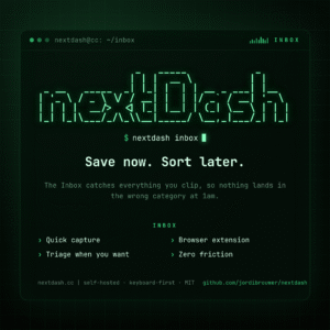
The Inbox header was also rebuilt to read like Health’s — same pills, same j/k, same shape of list, so it may as well be the same layout. Triage gets its own full-width row where its Health counterpart sits, and Mark read, Clear read, CSV, JSON, Import and Stats moved behind a ⋯.
Alongside that, five things the Inbox knew and did not say: rows show where a link came from — extension, import, share sheet — with paste left unlabelled, since that is how most links arrive and saying so on every row is noise. A weekly line reads N arrived and N were dealt with this week. Mark unread and tags got keys, u and l, having been right-click only, which a phone has not got. An empty filtered list gained a Clear filters button. And a tag filter matching nothing stopped cheerfully claiming Inbox zero, nothing is waiting while the links sat there hidden.
One number on your install will change, possibly by a lot. The promote rate is labelled “of the links you decided on, how many became bookmarks” — but its denominator also held every mark-read, and a link marked read is still sitting in the inbox with the decision still to come. So links that had gone nowhere counted as decisions, and any link read before being promoted counted twice. A store of 40 added links was reporting 43 of them decided. Promoted and deleted are the two ways a link leaves, and they are the whole denominator now.
Two hundred themes that all looked alike underneath
This one was invisible and slightly embarrassing. The backdrop pattern defaulted to dots, and only fourteen themes named an exception — which means 200 of the 214 variants painted the same dots. The theme browser changed the palette and left the texture identical, so three of the four backdrops read as features that did not work.
Every family now names its own, assigned by character: hatch for paper, cloth and earth, grid for circuitry, editors and steel, lines for screens, neon and signal, dots for mist, water and cool. The spread across all 214 variants is 56 hatch, 54 grid, 54 lines, 50 dots. Anything you pick yourself under Appearance → Backdrop still overrides every theme, and light and dark halves are named together so they cannot drift apart.
That work turned up four screen themes — Retro CRT among them — that had lost their scanlines in their light half, because only the dark selector was ever named. Found by a test that walks all 214 variants, not by eye; at that size, reading the file is not a check.
Two fixes in the picker itself: previewing a theme now shows that theme’s backdrop rather than the previous one’s, which meant you were previewing a combination matching no theme at all; and Escape closes the picker on the first press instead of the second.
Also here: each guided tour can be replayed on its own. Six exist and five could be seen exactly once — Health, Inbox, Fresh, Widgets and the column-spread hint each recorded that they had run and never offered themselves again. The only way back was Show quick-start card again, which clears the whole list. That is the right button when you are handing an install to somebody else, and far more than show me the Health one again is asking for.
The Back button
Opening the Inbox, Health or config, or switching bookmark page, now leaves a history entry. Before, none of it did: the history never moved, so Back stripped the address bar and left the view standing — the URL said one thing and the screen said another.
What counts as a step is deliberately narrow. A filter is not a step: change the Inbox filter three times and one Back leaves the Inbox rather than walking you back through them. A config section is not a step either, because a visit to config is a rummage through several sections and an entry each would turn one Back into six. Back leaves config the way Escape does.
In the same spirit: coming back to the window leaves you where you were rather than at the top of the page, and the Monitored list keeps your place across its own refresh — measured, a reader sitting at 400 pixels was being put back at 266.
The server log learned to speak
If you run nextDash in a container and have ever gone looking in its log for what it was actually doing, this is for you.
Every line now carries a level and a component, in one shape. All 67 existing log calls were rewritten — not with a search and replace, but each given a level, a component and a sentence written for someone who runs nextDash rather than someone reading its source.
Eight subsystems that had been silent now say what they did: a check round, a feed poll, an import, a capture, backup pruning, a failed write to the data directory, a custom widget’s outbound fetch, and webhook delivery. That sixth one matters more than it sounds — several callers had been quietly dropping the error when a write to your data directory failed.
Under Data & backups → Server log there is a Detail level — Quiet, Normal, Verbose — that takes effect on the next line rather than at the next restart, and an Activity trail with twelve channels deciding what goes into the JSON. The JSON now goes to the trail file instead of sitting between the readable lines in docker logs, which with twelve channels would have made that unreadable within a day. And the log viewer reads the level a line declares instead of guessing at it: it had been filing checked 110 bookmarks, 2 failed as an error, because the sentence contains the word failed.
Smaller things, and one deletion
- Eight settings can finally tell you they changed. A setting with no declared default reports itself unchanged whatever it holds, so it never offered its ↺ and never counted towards the Overview’s tally of what differs from stock. Of the 93 fields in the Behavior schema, nine had no default; eight now do.
- Four ways config said one thing and did another: one click on Export produced two CSV files, changing an Appearance control dropped keyboard focus to the top of the page, switching page threw away unsaved Widget edits without asking, and the archive URL said Saved while the server had quietly substituted the default.
- An install could go permanently silent about updates. Two settings record that onboarding is over, an install can hold one without the other, and such an install never showed release notes again — with nothing in the interface able to repair it, since the one thing that sets the flag is dismissing a card that no longer appears.
- 757 lines of JavaScript and 193 of CSS were deleted — the old inline bookmark editor, left behind with its gate permanently shut when editing moved to a modal. Nothing changes on screen, which is the point.
Upgrading
docker compose pull
docker compose up -d
From a git checkout:
git pull
docker compose -f docker-compose.prod.yml up -d --build
Nothing needs migrating. Three things are worth doing once you are on it: open a theme you have used for months and see whether it looks like itself now; press n on the one bookmark in Health you have been ignoring by hand for weeks; and if you use the Inbox, run t once against a real backlog, which is the first time that has genuinely been possible.
The full picture
Every change, with the reasoning behind each one, is in the changelog. The manual and Config → Help are current in all four languages.
nextDash is a keyboard-first, self-hosted bookmark dashboard. No accounts, no cloud, no noise — it tells you which of your links are already dead, how long they have been, and it can keep a copy of the page for you before that happens.
Source and downloads: github.com/jordibrouwer/nextdash
Previously: Widgets: your dashboard can show more than links