nextDash 1.3.3 rebuilds the page you land on. The overview used to answer “what is new?” in different places at once, none of them well, while the news from the project itself sat below the fold on most screens. It is one list now, newest first. The form for adding a bookmark got the same treatment for the same reason — it had grown taller than a laptop screen, so the Save button was out of sight on the machine most people use.
Behind those two visible changes sits something less glamorous and more important: an audit of the whole codebase. It turned up three separate ways you could lose bookmarks, a folder of your private data that was readable by anyone who could reach the app, and outage alerts that never left the building for an entire category of users. All of that is fixed here, and none of it needs anything from you beyond upgrading.
1.3.3 will open the What’s new window once after you upgrade. If you skipped 1.3.1 and 1.3.2, there is a short summary of those further down.
Source and downloads: github.com/jordibrouwer/nextdash — release notes: v1.3.3 on GitHub
nextDash 1.3.3 — 22 August 2026
The overview, rebuilt
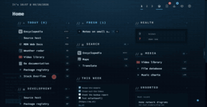
Here is what the old overview did, and it is worth spelling out because it is a good example of how a page goes wrong one reasonable decision at a time. It told you what was new in three separate places. There was a panel that showed you one new feature — one, out of forty-nine — which meant that seeing what the catalogue held took forty-eight clicks. Below that sat a “Latest update” box repeating the release name that the bar directly above it had already told you. And below that were the actual posts from nextdash.cc, which on a normal laptop screen started far enough down the page that most people never scrolled to them.
Meanwhile the top of the page — the most valuable space there is — was given over to statistics about your own library. Numbers you look up when you want them, not news you want to meet on the way in.
All three of those are now one thing:
- One list, newest first, saying where each item came from. Posts from the site, new releases, and the settings each release introduced, all in a single dated stream. Every row carries a small source label and its own way in — read the post, see what’s new, or jump straight to the setting. Six rows now fit in the space one sixty-word feature panel used to take, which is the real gain: not more room, but six times as many things you can actually do something about.
- You can narrow it, including all the way down. The source chips filter the list to one kind of thing — and one of the options hides the project’s own posts entirely. That matters more than it sounds: a news block in a self-hosted tool can easily start feeling like an advert, and the honest answer to that is a switch that turns it off.
- A dot and a count on Overview when something has been published since you last read the list. A first visit deliberately starts quiet rather than counting everything ever written, because a badge reading 156 on day one is a badge nobody looks at on day two.
- The full list lives under About → News & features, together with the forty-two older features from before the catalogue kept dates. There is also a button there that saves nextdash.cc as a bookmark, so that Fresh counts new posts for you — the tool following its own feed, which happens to be the shortest possible demonstration of what Fresh is for.
- Your own figures moved beside the news rather than above it, under a heading that says plainly they are about your install. The one thing that still comes first is anything actually asking for your attention — nothing gets in front of that.
Two smaller notes for the curious. The site feed now carries a short summary with each post and fetches ten of them instead of five, and it only re-downloads when something has actually changed — so a machine that reboots every night does not go knocking on the website every morning. And if you would rather your install never contacted nextdash.cc at all, DISABLE_NEWS_FEED=true switches the whole thing off, alongside the existing switches for the update check and for analytics.
Adding a bookmark
The add-and-edit form had eleven fields stacked on top of each other, which made it 735 pixels tall to add and 763 to edit. A 1366×768 laptop — the kind of machine most people are actually on — leaves you about 660 once the browser has taken its share. So the form scrolled, and the Save button sat below the edge of the window, on the exact machine where that is most annoying.
- On a wide window with a mouse or trackpad, the form is two columns and about 435 pixels tall, which fits comfortably. The split follows a real distinction rather than just cutting the list in half: on the left is what the bookmark is — name, address, icon, note — and on the right is where it goes and how it is watched. Tab still runs down one column and then the other. On a narrow window the single column comes back exactly as it was — and so it does on a touch screen at any width, because a landscape phone is nearly 950 pixels wide and is still a phone, where one column you scroll beats two you pinch at.
- The controls explain themselves, when asked. “Pinned” and the three availability buttons were an icon and one word each, with the actual explanation hidden in a hover tooltip — which is to say, no explanation at all if you are on a phone or tablet. Point at one, tap it, or reach it with the keyboard, and a small bubble tells you what it does. A screen reader gets the same sentence whether the bubble is open or not.
- Warnings no longer shove the form around. Every message — a shortcut already in use, a missing name, an address that is not one — used to appear underneath its field as you typed and push everything below it down. On an empty form, one keystroke in the name box was enough to make the address complain and shift the whole column. They are bubbles attached to the field now, and they wait until you have actually used that field. The form no longer greets you by pointing out what you have not filled in yet.
- Adding starts in the address box. The address is the one thing only you can supply; the name usually arrives with the page itself. Editing still starts on the name, which is what people are nearly always there to change.
- On a phone you get a shorter form. The icon buttons and the note are left out — the icon is fetched from the page anyway, and a text area under an on-screen keyboard that covers half the display is not a good place to write anything. They are hidden rather than removed, so editing a bookmark on your phone leaves the note and icon it already had completely untouched.
Three ways you could have lost bookmarks
This is the part of the release I would most like people to read, because these are the failures that do not announce themselves.
- A backup with no bookmarks in it emptied your library. Restoring a ZIP wipes any bookmark page the archive does not mention — which is correct behaviour for a real backup. But a file containing only settings, themes and icons mentioned no pages at all, so it cleared everything and then reported success. Such an archive is now refused before anything at all is replaced.
- Merging duplicates could delete a third bookmark that had nothing to do with the merge, and count the surviving bookmark’s opens twice. It happened when the same entry was listed twice in one merge: both were checked against the state before the merge, then removed one after the other from a list that had already shifted underneath.
- A delete that failed left the bookmark on the page twice. The recovery path put back bookmarks that had already been restored. The same gap existed in the inline editor, where a failed delete still said deleted, still offered you an undo, and that undo created a genuine duplicate.
One related fix: how long a link has been down now survives an edit. Saving a bookmark from a browser tab you had left open since before that link broke used to reset the history back to nothing.
A folder that should not have been open
nextDash has an optional write token — think of it as a password on the dangerous actions, for people running it somewhere less private than their own laptop. The audit found several places where it was not being asked for.
The worst was the data folder itself. It was being served as plain files, directory listing and all, which meant your settings, every page of bookmarks, your inbox, your trash, your health history and your stored backup archives could all be read by anyone who could reach the app — while the official backup route handed out that exact same content only behind the token. Only bookmark icons and any favicon or font you uploaded are served from there now.
Alongside that: the trash now checks what it takes back in, closing the one route by which a restore could return a link the rest of the app would have rejected. Listing and downloading an automatic backup now need the token, the way running, restoring and deleting one already did. And Send test alert now works on an install that has a token at all — it was not sending the token with its request, so it simply failed, on precisely the installs most likely to be relying on alerts.
Alerts that never arrived
If you set nextDash up to notify you when a link goes down, and you chose Pushover or browser notifications, you have not been getting those alerts. Not delayed, not intermittent — never sent, no matter how long something stayed broken.
The cause is almost funny. Alerts were being discarded whenever no webhook address was configured, before anything was even examined. But Pushover is set up with two tokens and a fixed address, so it never sets that field — and browser notifications do not involve a web address at all. In other words, the check ruled out two of the three ways of being notified, including the one where the settings screen does not even show you a field to fill in. And because Send test alert takes a different route through the code, testing your setup told you everything was fine.
It now checks whether you have a working way of being notified, rather than whether one particular field is filled in.
Smaller things, worth having
- Release notes now show up once, on their own. The machinery to do that had been in place a long time, but nothing guaranteed it, and the manual actually claimed the opposite. It is now a promise with a test behind it: an install that last read an older version gets the notes on its next visit, closing them records that, and no later visit reopens them. A browser meeting nextDash for the first time is deliberately exempt, since the quick-start tour is already running and release notes for a version you never used are just noise.
- Usage statistics round every number they send. The privacy setting has always promised that measurements are grouped into bands rather than sent exactly, and the two big snapshots kept that promise — but individual actions did not. A bulk recheck was reporting exactly 37, a health export exactly 1,274. That is more precise than the question needs, and on a small install a number like that is a fingerprint. The rounding now happens inside the single function every measurement passes through, so a new one cannot forget.
- Pin looks like the rest of the menu. Right-click a bookmark and you got a tidy column of small marks in your theme’s colour — and one red-and-yellow pin emoji, painted by the operating system, ignoring your theme entirely. It is drawn properly now.
- The characters
,,+and&can be typed again. All three were shortcuts that fired before the app checked whether you were in a search box, so they opened their own panel instead of reaching whatever you were typing into. - The dashboard paints sooner and scrolls more evenly. The font was arriving after the page instead of with it, bookmark icons were stalling the first paint, and dragging the window to resize it was making the grid recalculate its whole layout on every single pixel of movement.
- The browser extension is quieter and more honest. A save that failed because of a proxy error or a login redirect used to say nothing at all, since the badge is the only feedback those routes have. A success message shown shortly after an error no longer inherits the error’s disappearing act.
An honest note about translations
A cleanup in this release removed 765 unused text strings from the four language files — leftovers from panels and whole views that had been rewritten over time. That was the intended change, and it worked.
It also removed 199 strings that were very much in use. The tool that finds unused text skipped every folder named data, which was meant to mean the runtime data folder — but it caught static/data too, which is exactly where the feature catalogue lives and the only place those strings are named. The result was that About → News & features rendered entirely in English for Dutch, German and French readers.
They are back, the rule now matches the specific folder rather than the name, and the three checks that would each have caught this independently now run automatically on every change rather than when somebody remembers to run them.
If you skipped 1.3.1 and 1.3.2
Two smaller releases went out between 1.3.0 and this one.
1.3.1 made Fresh actually work. Fresh — the feature that lets a bookmark tell you how many things a site has published since you last opened it — shipped in 1.3.0 depending on link previews being switched on, which most installs have off. So it could never find a feed and sat there reporting nothing, indefinitely. It looks for feeds itself now, tells you what it found, and can show you which of your bookmarks are able to report anything at all. That release also gave Statistics a plain-language explanation of what its numbers mean, made a filtered bookmark list into a link you can save or share, and restored Ctrl/Cmd+click for opening a bookmark in a new tab — it had been ticking the row for a bulk action instead, which is the one modifier every link on the web honours doing the opposite of what it says.
1.3.2 rebuilt the card you get when you hover a bookmark. It repeated the address, left out the single most useful thing it could say (that you have never opened this), cut off its own last lines without indicating it had, and slid away from you as you moved toward it. It now answers three questions in a fixed order — what this is, what it says, and what you already know about it — and it holds still. You choose whether it appears at all: off, on hover, or keyboard only, with eight checkboxes for which rows it shows. That release also fixed a genuinely bad one: opening a bookmark and then editing anything else on the page reset that bookmark’s open count to zero.
Upgrading
If you are running the Docker image:
docker compose pull
docker compose up -d
Building from a git checkout instead:
git pull
docker compose -f docker-compose.prod.yml up -d --build
Or straight from source, without Docker:
git pull
go build -o nextDash && ./nextDash
Nothing needs migrating, and one setting does change: the news stream is switched on for existing installs, which means your server starts fetching nextdash.cc by itself after the upgrade. If you would rather it did not, the source chips hide the site’s posts, the setting itself sits under Privacy, and the environment variable above stops the server asking at all. Two other things are worth doing once you are on it. If you use Pushover or browser notifications for outages, send yourself a test and then trust it — it means something now. And if you have ever restored from a backup archive and been surprised by the result, this is the release where that particular surprise stops being possible.
The full picture
Every change above, plus the tests and documentation that came with them, is in the changelog. The manual and the README were brought back into line with what the app actually does — including a full and accurate list of what the usage statistics measure — that section had been written before Fresh, category spreading, right-click menus and two thirds of what Health reports even existed. Config → Help carries the same three security points, in all four languages.
nextDash is a keyboard-first, self-hosted bookmark dashboard. No accounts, no cloud, no noise — and it tells you which of your links are already dead, and how long they have been.
Source and downloads: github.com/jordibrouwer/nextdash
Release notes for this version: v1.3.3 on GitHub