A long one. 1.11.0 is the largest release nextDash has had – a hundred and twenty-six changes across 269 files – and one question sits behind most of it: where does a thing live? The buttons floated over the grid on a bar with no home. The page tabs, the clock and the view’s name each owned a band of their own. Config opened on a wall of every setting at once, and the bookmark list was a table with a dialog on top of it. All four have a place now, and a fresh install starts on a new look.
Source and downloads: github.com/jordibrouwer/nextdash
Release notes: v1.11.0 on GitHub
Unlike the last few releases, this one changes what you see the moment you upgrade. That is deliberate, it is explained below, and there is a way back for every default that moved – the short version is under Upgrading, at the bottom.
The top of the page is one row
Until 1.10 the top of the dashboard was three bands stacked on each other: a line for the clock and the weather, a line for the page tabs, and a 60px band that held the name of the view and nothing else. Each band was reasonable on its own. Together they pushed the first row of bookmarks a good way down the screen, to tell you things you could mostly see already.
It is one row now, in three zones. The clock and the page’s name stand on the left, the page tabs in the centre, the destinations and the actions on the right. The 60px band is gone, and the bar sits at the top of the page with the grid’s own air underneath it rather than a rule.
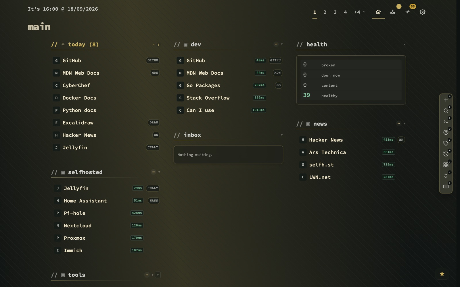
Inside that row, most things became a choice rather than a fact:
- The page switcher is one of four. Numbers beside the destinations (the default), one segmented control, plain text tabs, or a single button with a list of its own.
:switchertries them in place, without opening config. - Three to nine tabs before “+N”, five to begin with. What does not fit is counted rather than dropped, and every page keeps its digit key whether its tab is drawn or folded.
- The clock and the weather stand where you put them – beside the view name, in a column of their own, or on their own line with the name underneath. That third one is the old top of the page, offered back as a placement, and it is what every install starts on.
- Plain or plated controls. Plain underlines whatever is current; plated gives each control its own box. Under plated the action buttons and the tabs stay bare, because a box inside a box read as a second bar.
- A dashboard destination beside inbox, health and config, so there is a way home that is not the Escape key. The inbox and pages buttons can each be switched off, and their keys keep working.
One row has to decide what it gives up first when the window narrows, and it does so in one fixed order: the actions fold away before anything else, and the page switcher and the destinations are the last things to go. While I was at it, the key chips in the header lost the ring they carried, stopped sitting dimmer than the labels beside them, and the action glyphs lost the extra weight they had over the buttons they stood in – with the contrast measured on every theme rather than on the one I happened to be running.
The buttons that floated have somewhere to stand
The fixed buttons – search, commands, finders, recents, the tag cloud, the cheat sheet and the rest – used to sit on a bar that floated over the grid. It had no home, so it lived on top of whatever was underneath it, which was usually a bookmark you wanted to click.
The floating bar is gone. Under Config → Appearance → Action bar, or :buttons from anywhere, the buttons stand in one of five places:
A side column takes its room from the page margin rather than from the grid, so switching between them does not reflow your categories. Every action button is on to begin with, and up to nine stand before the fold; what the header cannot show goes behind one control whose menu names each action with its key – down to two actions on a narrow window.
The key on each button is a chip now, and the chips can be switched off. With them off, resting on a button shows its key beside it instead. A new install starts with the chips on; a dashboard that already existed starts without them, because you have presumably learnt the keys by now. The popovers that used to appear on the action buttons are gone – a tooltip on a button that already carries its key is a second label saying the same thing.
A bar that gets out of the way, and leaves a handle
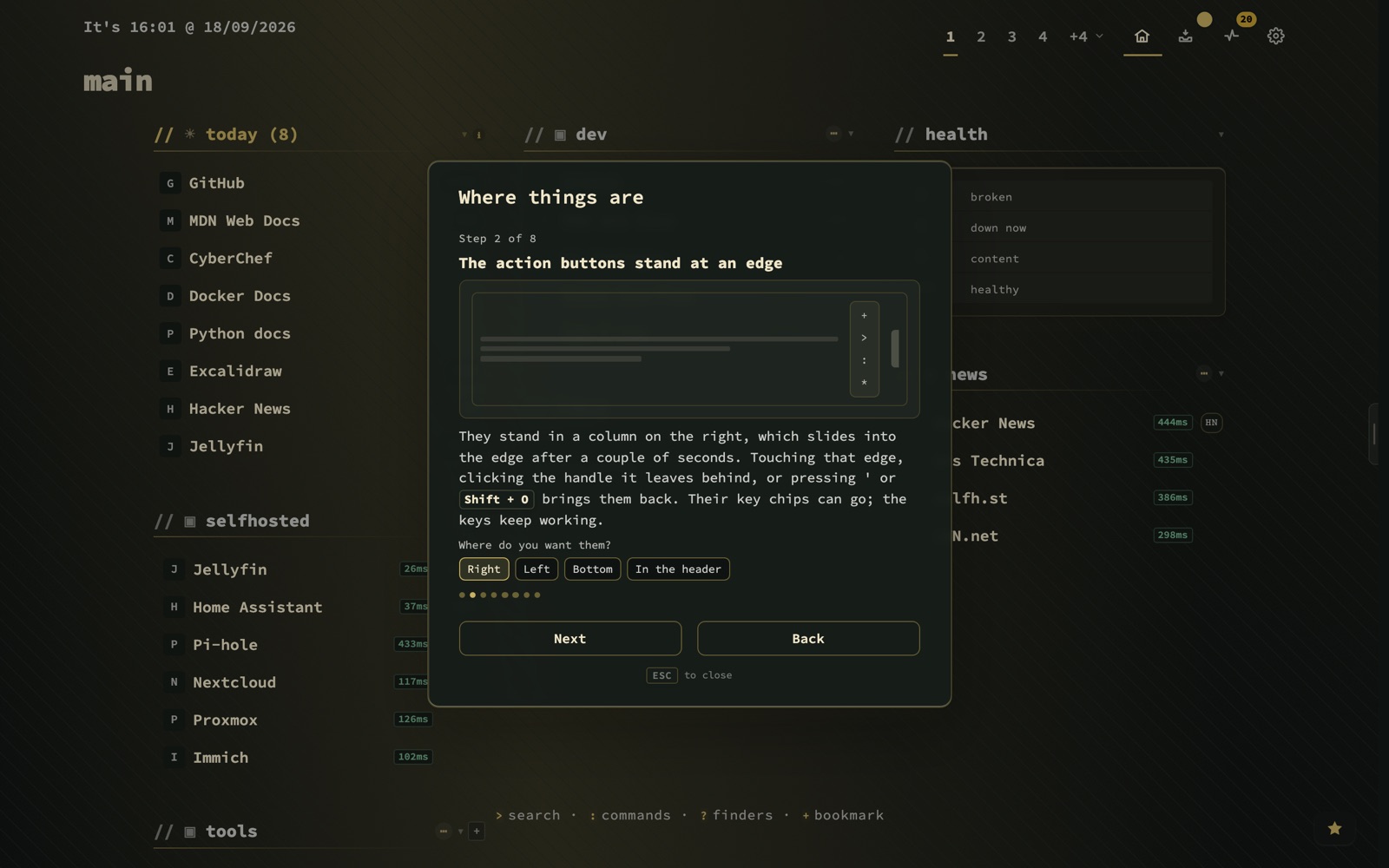
A docked bar slides into its edge after two seconds by default – or five, ten, thirty, or never. It comes back when the pointer touches that edge, when keyboard focus moves into it, and on ' or Shift + O. A bar you are using never leaves while you are using it; the timer only runs once you have gone.
Where it went, it leaves a handle: quiet at rest, larger and clearer as the pointer gets near, and a click on it brings the bar back too. There is no handle in the header or behind the menu, where nothing slides, and none on a touch screen, where there is no pointer to get near anything.
The bookmark list became a workbench
Config → Bookmarks → List was a table, and changing anything in it opened a dialog on top of the table you were reading. Change three bookmarks and you opened, filled and closed that dialog three times, losing your place in the list each time.
It is a workbench now: filters in a rail on the left, the rows in the middle, and an edit panel on the right. The panel edits the bookmark under the cursor, or – tick a selection – every one of them at once, with tag suggestions and the monitor interval standing right there instead of on another tab. Fifty bookmarks is one edit.
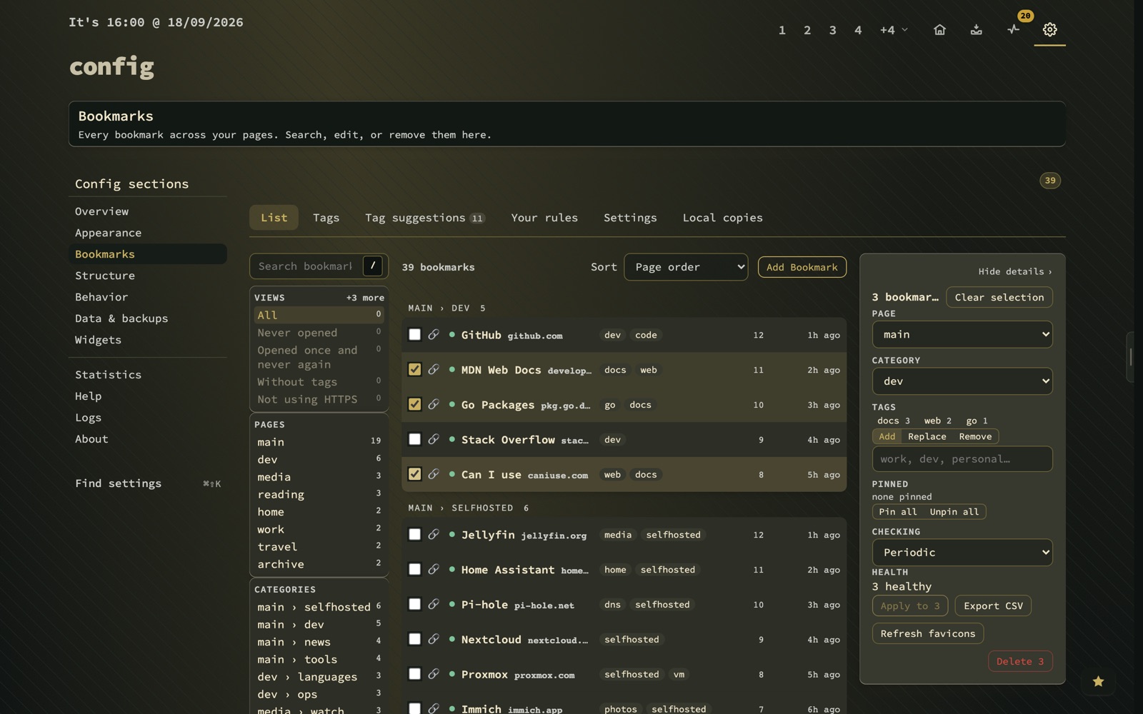
The rows are slabs you walk with the keyboard. Favicons are drawn whole rather than cropped, the pin is drawn where it belongs, the name gets the room, and the tags that do not fit are counted rather than silently dropped. The shortcut column is gone. Shift + E still opens the full dialog when you do want it, and the panel keeps its place after a move or a bulk edit, so you are not thrown back to the top.
On a narrow screen the rail folds into a drawer and the panel into a sheet. This one was specced and planned before a line of it was written, and it runs on a model of its own rather than on the old table’s code with a new coat of paint.
Config opens on tiles
Appearance and Behavior used to open on every setting they held, one after another. That is complete, and it is also how you end up scrolling past forty controls to find the one you came for. Both sections now open on a hub of tiles, one subject each.
A tile opens its group, and Escape goes back. The two to four settings a group leads with are cards, each with an explanation, its default and one kind of control – not a toggle in one place and a dropdown for the same kind of choice in the next. Everything else is behind More settings, one click further, where it cannot crowd the things most people come for.
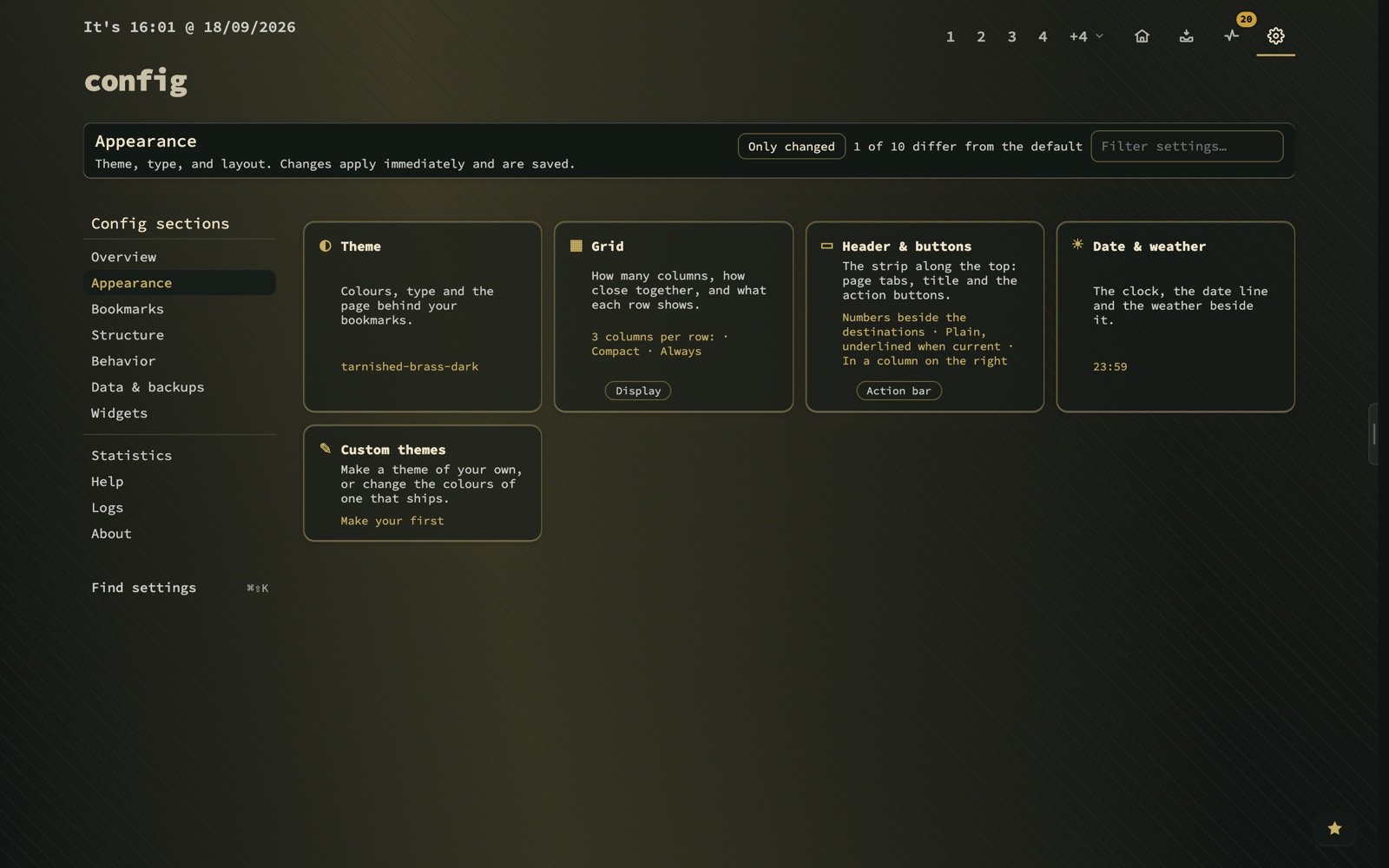
A few things moved to where they belong while this was going on. Date & weather is under Appearance now, and the weather location is a card of its own rather than a field behind More settings – it saves while you type, so the header line answers as the town is written. Toolbar & tabs is called Header and buttons, which is what it sets. And Logs has a section of its own, split into the server log and the activity trail, each beside its own settings. The activity log gained channels for search, keys, navigation, sessions and client errors, and records how a bookmark was opened.
Under the hood, config no longer arrives in one piece. dashboard-config.js was 27,627 lines, downloaded whole to draw one section. Logs and Help are files of their own now, fetched when you open them through a single table of section modules, and the rest loads when the browser is idle after the first paint. It is the first cut rather than the last – an earlier attempt to split the whole file in one go broke 41 tests, so it is coming apart one section at a time, each move checked byte for byte.
The look settled
Three releases in a row worked on how a surface is made – depth in 1.6, glow in 1.9, glass in 1.10. 1.11 is where that settles into a default. A fresh install opens on Tarnished Brass, in glass, with a soft glow, the theme’s own backdrop and the contrast that reads as Normal. An install that already answered those questions keeps its answers; nothing about your current theme changes.
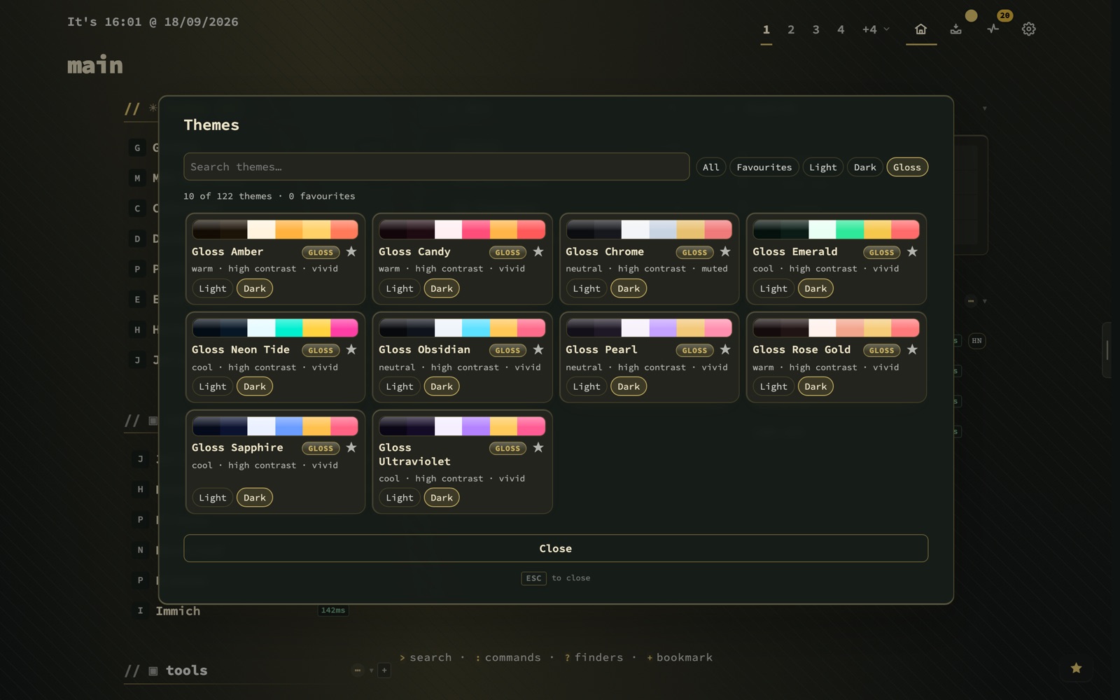
Ten Gloss families are new: Obsidian, Chrome, Candy, Amber, Emerald, Sapphire, Neon Tide, Pearl, Rose Gold and Ultraviolet, each in a dark and a light half. They carry a lit band along their top edge and a badge in the theme browser, which has a Gloss filter of its own. The sheen is not a privilege of those ten: the Gloss slider in the theme editor gives the same finish to a theme you built yourself, or to a packaged one you recoloured.
That is part of a larger rule. A custom theme can now set everything a packaged theme can – depth, glow, glass, corner radius and sheen – and it comes as a light and a dark half, like the built-ins. It used to be a set of colours with the material decided for it. Relatedly: a theme no longer loses its character when its colours are saved, which it quietly did before.
Widgets stopped being grey panels
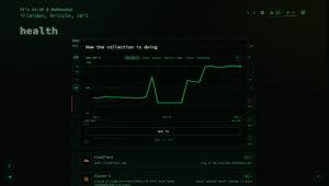
A widget tile used to be drawn one step up the surface ladder with a cast shadow. On every theme, that read as a grey-white panel pasted onto the dashboard – fine for a single widget, odd for a page with six. A tile is the page’s own colour one step off it now, with its cells one step further; under glass it is see-through and blurred, with the lit edge back. The Health trend widget is drawn like the health view’s summary tile too, with the same figures in the same words, and it no longer draws itself twice when two renders overlap.
Moving things has a cost, so the release explains itself
Moving this much is a cost, and it is paid by the people who already knew where everything was – which is to say by everyone reading this. So 1.11 carries its own explanation. A card in the corner offers, once, a one-minute tour of what moved: Show me, Later or No thanks.
Eight steps say where the pages, the action buttons, config, the list, the widgets, the tags and the themes are now, and where it helps, the step lights up the real thing on the page behind it rather than a picture of it. Where a default changed, the step carries the choice: the old arrangement is one click away, right there, and picking it writes the setting on the spot – without a trip to config to find out what the setting is called. The tour can be reopened from Config → Help → Guided tours or :changes, and the release notes stay where they always were.
The first-run setup window went the other way. It asked a new reader for a language, a theme and a link behaviour before they had seen the dashboard those answers were about – answers nobody can give yet. It is gone. The checklist in the corner stays, every setting it used to ask for is in config, and the one thing a new install genuinely needs to know – a town, a clock format and a unit for the weather line – is asked once, in the corner, when there is something on screen to look at.
And the smaller things
- Escape on a bare grid goes home, and a second press opens search.
- A bookmark opens by its own key while the cursor is on the grid, and a row says so while it is being waited on.
- Select all sits in the ⋯ menu of both Inbox and Health. It ticks every row the current filter shows and reads Deselect all once they all are, so the bulk bar is reachable without knowing
Ctrl/Cmd + A. - The pages panel is drawn the way recent bookmarks is, with New page as a button rather than a dashed row, and a page can be deleted from it – asked twice. Recents answer one word with every kind of match, drawn as tiles. Both open from the search panel, where the other modes already live.
- The ★ moved to the bottom-right corner; the cards in the other corner stand at the bottom edge, and the toast stands with them.
- The quick-start checklist can finish. Open Config was ticked by a click on a header link that stopped existing when config became a view of its own, so the step went on asking for something you had already done.
- Only changed shows that it is pressed. The rows narrowed while the button went on reading not pressed – to its own styling and to a screen reader.
- Help, the tips and the manual were rewritten for the app as it is, in all six languages, and old links to panels that moved still land on them.
If you skipped 1.8 to 1.10
Three releases went out between the last post and this one without one of their own. In short:
- 1.8.0 taught Config → Bookmarks to propose tags in bulk – from the tags you already gave a site’s other bookmarks, from rules you write, and from a shipped catalogue of 463 subjects, so a fresh collection has something to propose on the first visit. A scan round reads the pages nothing else can place, and a suggestion can be opened to see which bookmarks it means before you accept it.
- 1.9.0 renamed Pages & tags to Structure and moved Tags under Bookmarks, where a word a bookmark carries belongs. The glow under a raised surface, built for four character themes, finally reached almost every theme – 132 of 222 had derived to exactly zero.
- 1.10.0 folded the classic and modern layouts into one, made glass three tiers worked out per theme, and drew every overlay – search, the cheat sheet, recents, the tag cloud, the bookmark form, the context menus – from one design. Search, commands and finders became one panel with a mode switch, so
>,:and?open the same door.
Upgrading
docker compose pull
docker compose up -d
Nothing needs migrating by hand, but this time things do change on screen the moment you are on 1.11.0:
- The floating bar is gone. The fixed buttons stand in a column on the right. The tour’s second step moves them to the left, the bottom or the header in one click, and
:buttonshas all five places. - The header is one row, and Appearance and Behavior open on tiles. Ctrl/Cmd + Shift + K still finds any setting by name.
- Your theme stays yours. Tarnished Brass, glass and the soft glow are what a fresh install starts on; an install that already chose keeps its choice.
- The key chips on the buttons start off on an existing dashboard, since you already know the keys. One switch turns them on.
The card offering the tour appears once. If you dismissed it by reflex, :changes brings it back.
Source and downloads: github.com/jordibrouwer/nextdash
Previously: the first widgets that look outward