Two things happened in 1.6.0, and they turned out to be the same thing. A theme stopped being a list of colours and became a set of decisions about material — how solid a surface is, how much light bleeds off it, how faint the faint text is allowed to get. And Health and the Inbox stopped being two views that happened to look similar and became two views built out of one shell. Both are about the parts of the app that were being drawn twice, slightly differently, by nobody in particular.
Source and downloads: github.com/jordibrouwer/nextdash — release notes: v1.6.0 on GitHub
Two things change on screen the moment you are on 1.6.0, both deliberate, both explained below: 111 dark themes get a different backdrop, and Health looks substantially different. There is a note at the end about what that means for an install you have had running a while.
A theme is more than a palette
A nextDash theme has always been thirteen colours. That is enough to make an install look like a terminal or like paper, and not nearly enough to make it feel like one. A terminal is not simply green: it glows a little, the panels sit close to the background, the labels are spaced out and shouted in caps. Paper does none of that. Both were being drawn with the same surfaces, the same corner radius and the same amount of nothing behind them.
A theme can now carry seven optional fields beyond its colours: how solid a raised surface is, how much blur sits behind it, how much accent bleeds around it, a radius scale, and three about the category headings — their casing, their letter spacing, their weight. Every one is a clamped number or a word from a fixed list, so no CSS ever crosses the boundary and sanitising is a clamp rather than a parser. The zero value of each is exactly the old behaviour, so every existing theme and every hand-made one renders precisely as before until somebody decides otherwise.
Glass, a fourth depth
depth
Beside Flat, Soft and Rich there is now Glass: raised surfaces go translucent and the page shows through them, in the classic layout as well as the modern one, and in the modals and the search overlay too. It is the depth that most obviously needs the background wash the theme engine already draws, and the first one where moving the window behind a modal does something.
A theme glows without being told to
Four themes out of 222 declared a glow. The other 218 were flat by omission rather than by intent — nobody decided paper should not glow, it simply never came up. So it is derived now, from three things the theme already tells us: how much colour the accent actually carries, how light it is, and how dark the page behind it is.
The colour measurement is the part I would get wrong if I did it again from memory. Chroma in OKLCH, not HSL saturation — because HSL calls #58A6FF fully saturated on the strength of one channel touching 255, which would have handed a soft desaturated blue the same glow as neon. That distinction is the difference between the feature working and the feature looking like a bug. Terminals and neons come out at the top, editor greys around 0.20, paper at nothing. A theme that names its own still gets exactly what it named.
The faint text was quietly failing
A theme picks its three text colours against the page background and never adjusts them again. But the surface ladder rises above that background — a card on a panel on a page — so every layer costs contrast that nobody accounted for, and the text that suffers most is the text that was already faint on purpose.
Secondary and tertiary inks are derived per surface now, holding their distance wherever they land. Getting the step right took a second pass: at 0.44 the plain dark theme still fell short, because its top surface sits a step lighter than the rest of its ladder and tertiary text reached only 4.05:1 there, under the 4.5:1 floor for body text. The step is 0.47 — the smallest value that clears the floor on every shipped theme and every surface, worst case 4.56:1. The stylesheet, the server default and the test that measures it all move together, and the test walks the whole register rather than a sample, because a floor checked on six themes is not a floor.
And a pair of themes now agrees with itself
The backdrop shape behind the page is picked by hashing the theme’s id. A light and dark variant are two different ids — so 111 of the 224 built-ins had their two halves land on two different recipes. A diagonal wireframe on one side, a glow from below on the other, when the only thing Quick mode is meant to change is the colours. A dark id is hashed as its light counterpart now, so a pair always shares a shape. Custom themes and the plain light/dark defaults are untouched.
This changes the look of 111 dark themes. Each is now drawn with the shape its light half already had, which is the one that was chosen on purpose.
Health and the Inbox now share a shell
ten tiles, repeating the counts of the pills below
four filters sat past the right edge
one column, every filter visible with its count
readouts on top, header stays put while you scroll
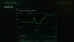
Health lost its wall of tiles
Health opened with a wall of ten bordered tiles, and directly underneath them a strip of filter pills carrying the same counts. The design note I wrote for this work opens by naming that: the tiles and the filters are the same control, drawn twice. Once you see it you cannot unsee it, and it explains why the view felt busy without ever being informative.
- Every filter is a row in a left column with its count, the way the Inbox now does it too. Score, the trend, the broken count and the report’s age sit above them as plain readouts — figures that never had a filter behind them and were pretending to be buttons.
- A filter with nothing in it drops out and comes back when it fills. Broken, Content, Duplicates, Unchecked and All always stay, because a view whose furniture moves every time you look at it is worse than a couple of empty rows.
- Monitors became a place instead of a filter. Opening it swaps the list for the fleet panel — pooled uptime, worst performers, recent outages — rather than narrowing the list, which is what Monitored still does. It has its own address, so it is bookmarkable and comes back on reload. And because Monitored and Monitors sitting one above the other with the same count is precisely the fault this work exists to fix, the second one reads All monitors now, matching the panel’s own heading.
- The header stays put while you scroll. Work through, Rot report, the ⋯ menu and the ℹ explainer are reachable from anywhere in a long list rather than only from the top, and on a narrow screen the left column becomes one scrolling line so a phone gets the list instead of four rows of controls above it.
- Rows can be compact or comfortable, and it is one setting for the whole app rather than one per view — already the setting the other lists will read as they move onto the same shell.
A review session can now say “not this one, not this month”
Working through broken links, the card offered Re-check, Open, Delete and Skip. For a link that is broken on purpose — a service switched off for the winter, a host that only answers from another network — none of those is honest. Skip brings it back tomorrow. Delete is not what you meant.
Ignore 30d (z) is the missing answer, and it makes the same write the row menu’s z makes, so a link silenced in a review session is silenced everywhere and returns on the same day. The row leaves the session afterwards, for the same reason a deleted one does: it has been answered, and a session that keeps showing you what you have already dealt with is not counting honestly.
The Inbox has the same shape now
The Inbox went through the identical change, and this is the part I would have written first if I had realised how much it mattered: the two views now teach each other. The filters are in the same place, the counts read the same way, the arrow keys move the same distance, the density setting is one setting rather than one per view. Learning your way around Health is now learning your way around the Inbox, which for two screens you visit for related reasons is worth more than either rebuild on its own.
- The filters moved into a left column with their counts, and the row of tiles above the list is gone — it was showing those same counts a second time, the same fault Health had.
- This week sits above the filters as a plain readout. It was the one figure that never had a filter behind it, so it was the one tile that could not be clicked, sitting in a row of tiles that could. It is a figure now and reads as one.
- Snoozed and With note appear only when there is something in them and drop out again once there isn’t — the same rule Health’s optional filters follow.
- The header stays put and shrinks to a single bar as it sticks, so Triage is reachable from anywhere in a long list. That matters more here than in Health: triage is the thing you press after scrolling through what arrived, which is exactly when the button used to be off-screen. The left column sticks with it, so the filters are one click away wherever you are rather than a strip of empty space keeping them company.
- On a narrow screen the left column becomes one scrolling line. The figures move up under the title and the ℹ explainer joins the ⋯ menu, so a phone gets the list instead of four rows of controls above it.
- Rows can be compact or comfortable, reading the same app-wide setting Health does.
- The site filter stopped sending the hostname you picked to analytics. It reports a fixed marker instead, under the same event name as before — the domains in your own inbox are nobody’s business, including mine.
One more, found after the rest was already in: clicking a row’s domain chip behaved differently from picking the same site out of the filter list. The chip’s handler was a hand-rolled copy of the filter reset that skipped two steps — it left a stale selection anchor behind, so a later Shift+click could extend a selection straight through rows the narrower view had never shown you, and it never wrote the choice down, so the site did not survive a reload the way the select’s does. It goes through the same path as every other filter change now. Two ways of doing one thing is how these bugs get in, which is the entire argument for the shared shell in the first place.
The unglamorous half
Moving two views onto one shell turns up things that were broken in both, and a few that were only broken in one and nobody had noticed. The keyboard could not step past the first filter neighbour — a second arrow press landed back where the first one did, because focus had never actually moved. The rail’s 24-hour uptime reading was permanently 0%, having read a two-part measurement as a plain number, which is not a number at all; it reads no data now while nothing has been sampled. The trend sparkline had lost its last caller when the tiles moved and simply stopped being drawn. Typing in the search box rebuilt the entire view behind your cursor. And the keyboard focus ring was invisible on filter rows in the classic layout — not a regression, an older bug the migration finally exposed.
One of those is worth naming on its own: the shared summary row accepted a string and set it with innerHTML, trusting every caller to escape first. It takes a built node now and appends it, so a future caller handing it a bookmark title or a URL cannot inject markup through it. The only current caller draws a sparkline and does not care either way — which is exactly when to fix it, before the caller that does care exists.
The dashboard, tidied
- Typing in the filter box made every widget disappear. The filter hides a block when nothing inside it matches, and it counts matches by the bookmark links within. Widgets carry the same class the grid measures and drags by, and hold no links at all — so every widget counted as empty the moment you typed a first letter, and the clock and the weather vanished while you were filtering bookmarks. It walks categories only now.
- Escape threw away your selection while closing a popover. The grid’s key handler stands aside for the action popovers, listed by id, and three were missing from that list — so Escape closed the tag list and ran the grid handler, which saw a live selection and cleared it. You dismissed a popover and lost the twenty rows you had picked to tag. One Escape closes one thing now.
- The quick-action toolbar followed you into Config, Inbox and Health, along with its keys. It is a dashboard tool; it goes inert the moment a full-container view opens and comes back when it closes. Fixing that exposed a second bug immediately: making the tag-cloud toggle dashboard-only folded together two different questions — whether the feature is available at all, and whether its button belongs on this screen — so stepping into another view read as “the feature is gone” and dropped your active tag filter on the way. They are asked separately now, and the header chip that exists to show an active filter in those views has something to show again.
- Long category titles never shrank to fit. The fitter asks the page what the smallest allowed size works out to, then steps the title down toward it — but it asked a loose element while the size is set on
body, so the answer came back as the size the title already was. The floor met the ceiling and the loop exited before its first pass. - Pressing
?twice broke the search you then typed. A second finder line landed inside the first, spaces started reaching the query, and typingjordibrw.nlsearched for??JORDIBRW.NL. Once you are in finders the key has nothing left to do, so it does nothing. And an empty finder list now says so and offers the way to fix it, rather than falling through to “no matches” and offering to bookmark the nothing you typed. - Alt+←/→ on a category header did nothing on a page you had never dragged, because the stored arrangement it edits does not exist until a drag writes one — while the screen reader was cheerfully announcing the move. It reads the current arrangement off the grid first now, so the keyboard writes the order a drag would have.
And the release-notes window lost a year of history
The back catalogue held 188 entries, 148 of them from the dated numbering scheme used before 1.0 — so scrolling the window walked you through a year of notes for a version scheme the app does not use any more. It starts at 1.0.0 now, 40 entries, newest first.
One correction rides along that I only found because it broke something visible: a release had been dated four days after it actually shipped, which put it above a genuinely newer one and pushed the newest release off the Overview panel entirely. The date is right now.
Upgrading
docker compose pull
docker compose up -d
From a git checkout:
git pull
docker compose -f docker-compose.prod.yml up -d --build
Local builds got one fix worth knowing about if you run from source: a container built with make up could report its version as dev while the docs alongside it claimed a real release, because the version was only ever supplied by the CI build. The compose files interpolate it from the environment now and the Makefile derives it from the release index — the same field the app already treats as the source of truth. A plain docker build with no build argument still falls back to dev, as it should.
What will look different, and what to do about it
Health will not look like the view you know, and neither will the Inbox. The tiles are gone from both, the filters are down the left, the header follows you. Because the Health tutorial taught a layout that no longer exists, it is shown once more — including to people who have already seen it — and the Help pages and the manual were rewritten for both views rather than being left describing furniture that has been removed.
If you run a dark theme, its backdrop has probably changed. That is the 111-theme fix: your dark half now uses the shape your light half was already using. If you preferred what you had, Appearance → Backdrop still overrides every theme with your own choice.
The faint text on your install is a slightly different colour. It is derived per surface now instead of being fixed against the page background, which mostly means it stopped disappearing on the higher layers. If you have built a custom theme, nothing you declared has changed — the derivation only fills in what you left unsaid.
Two minutes well spent afterwards: open Appearance → Theme → Depth and try Glass against a theme you already like, and open Health once to see where everything went before you need it in a hurry.
The full picture
Every change, with the reasoning behind each one, is in the changelog. The manual and Config → Help are current in all four languages, including the rewritten Health and Inbox chapters.
nextDash is a keyboard-first, self-hosted bookmark dashboard. No accounts, no cloud, no noise — it tells you which of your links are already dead, how long they have been, and it can keep a copy of the page for you before that happens.
Source and downloads: github.com/jordibrouwer/nextdash
Release notes for this version: v1.6.0 on GitHub
Previously: Widgets: your dashboard can show more than links