The dashboard
Your start page: a header with clock and weather, categories and widgets in columns, and edit mode in one key.
- 1-9 Switch to that page
- + Add a bookmark
- > Search
- : Commands
- / The tag cloud
- . Fold or unfold every block
- ShiftE Edit mode
- v Preview card of the selected bookmark
- ShiftH Show or hide the key legend
- ShiftS Show or hide the mode strip
- ? Keys and help
The dashboard is the page you start from. A header with the clock, the weather and the page switcher stands on top, and under it your bookmarks sit in categories and your widgets beside them, in columns. Everything else, the Bookmarks view, the inbox, the Containers view and config, is one icon away in the header, and Esc brings you back.
Try it
- Press 2 for the second page, 1 to go back. Every page keeps its digit key.
- Click the date at the top left for a week overview.
- Point at a bookmark, or select it and press v, for its preview card.
- Press Shift + E for edit mode, then click a category.
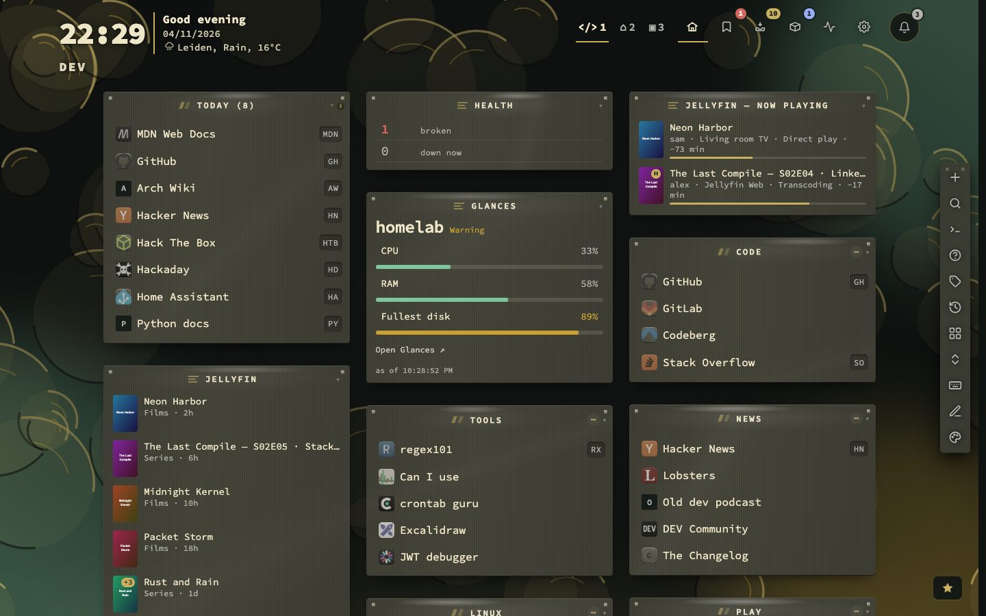
The header
The header has three zones. On the left stand the time and date, the weather line and the name of the page you are on. In the middle stands the page switcher, in the styles that have a box or tabs. On the right are the destinations, with the page numbers beside them in the default style: the dashboard, the Bookmarks view with a badge for a broken link, the inbox with its unread count, the Containers view with a badge for updates waiting, and config. Each destination can be switched off, and its key keeps working. As the window narrows, the header folds its parts away in a fixed order, so the switcher and the destinations stay reachable.
The switcher comes in four styles: numbers beside the destinations, one segmented control, plain text tabs, or one button with a list. Every page keeps its digit key. Double-click a tab to rename the page and give it an emoji and a colour dot.
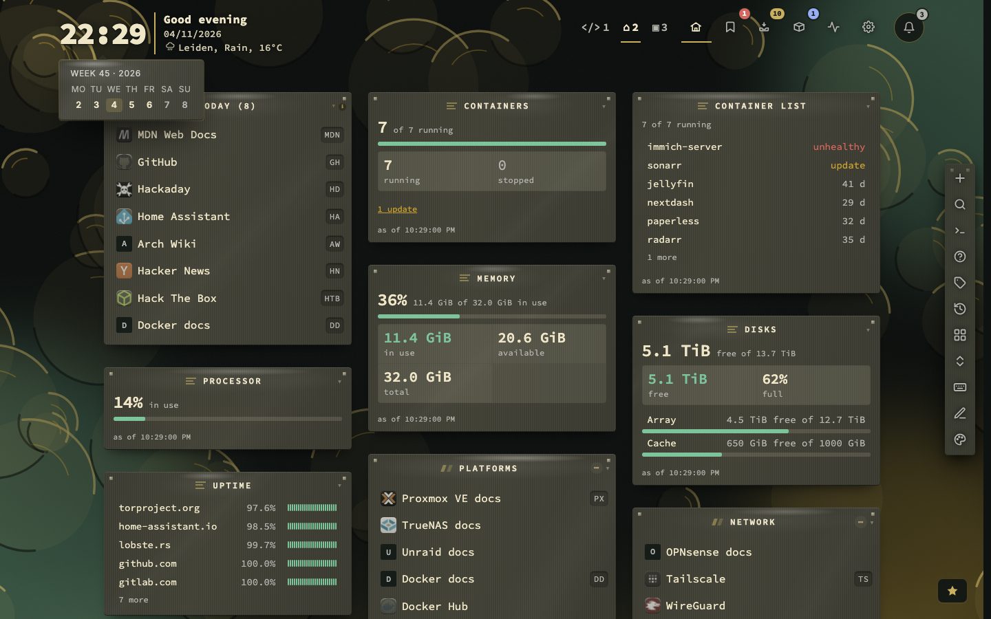
A greeting and the bell
The clock can stand large, with a greeting beside it that follows the hour: Good evening, Jordi. Config, then Appearance, then Date and time, sets Your name in its own Greeting group; leave it empty for a greeting without one. The quick start asks for the name once, and an existing dashboard asks in a short note.
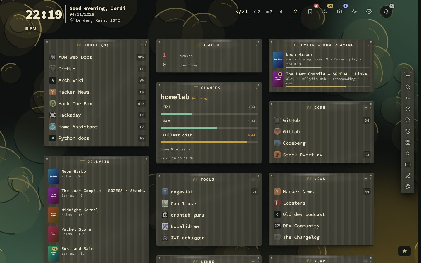
The action buttons
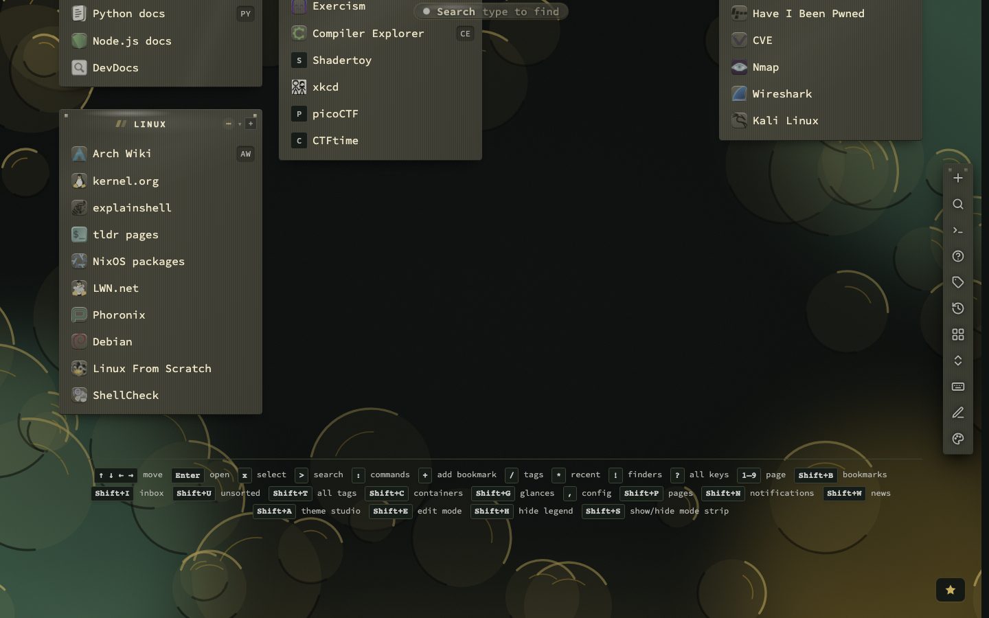
Eleven buttons put the main actions in reach of the mouse, each with its key: add a bookmark (+), search (>), commands (:), finders (!), the tag cloud (/), recent bookmarks (*), pages (Shift + P), fold all (.), keys and help (?), edit mode (Shift + E) and the theme studio (Shift + A).
A fresh install puts them in a column on the right that slides into the edge after two seconds. They can also stand on the left, in a dock at the bottom, in the header, or behind one menu. Hiding a button leaves its key working. Config, then Appearance, then Action bar, holds all of it.
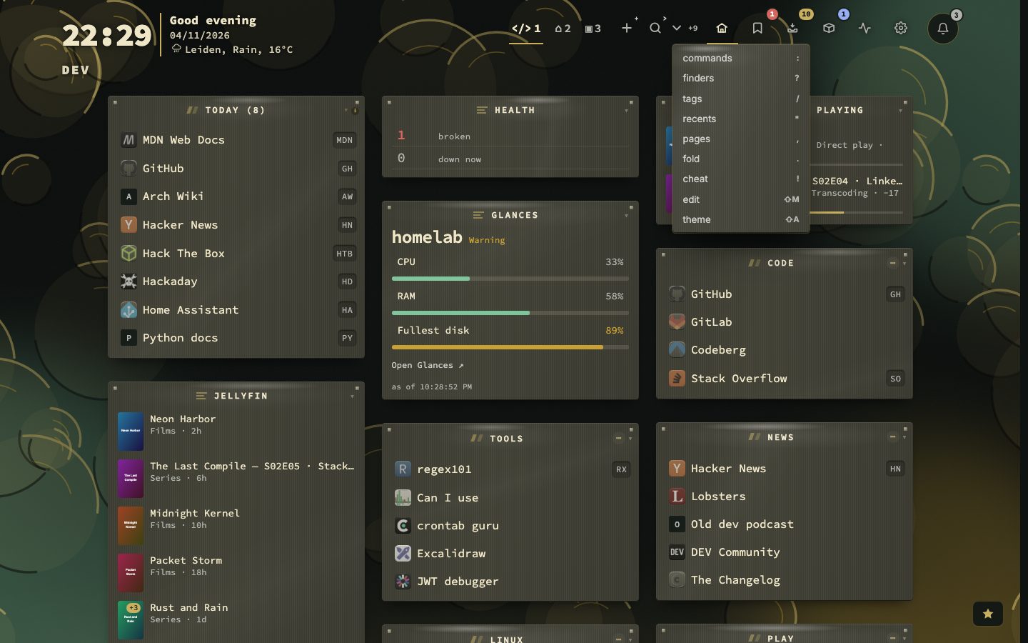
Edit mode
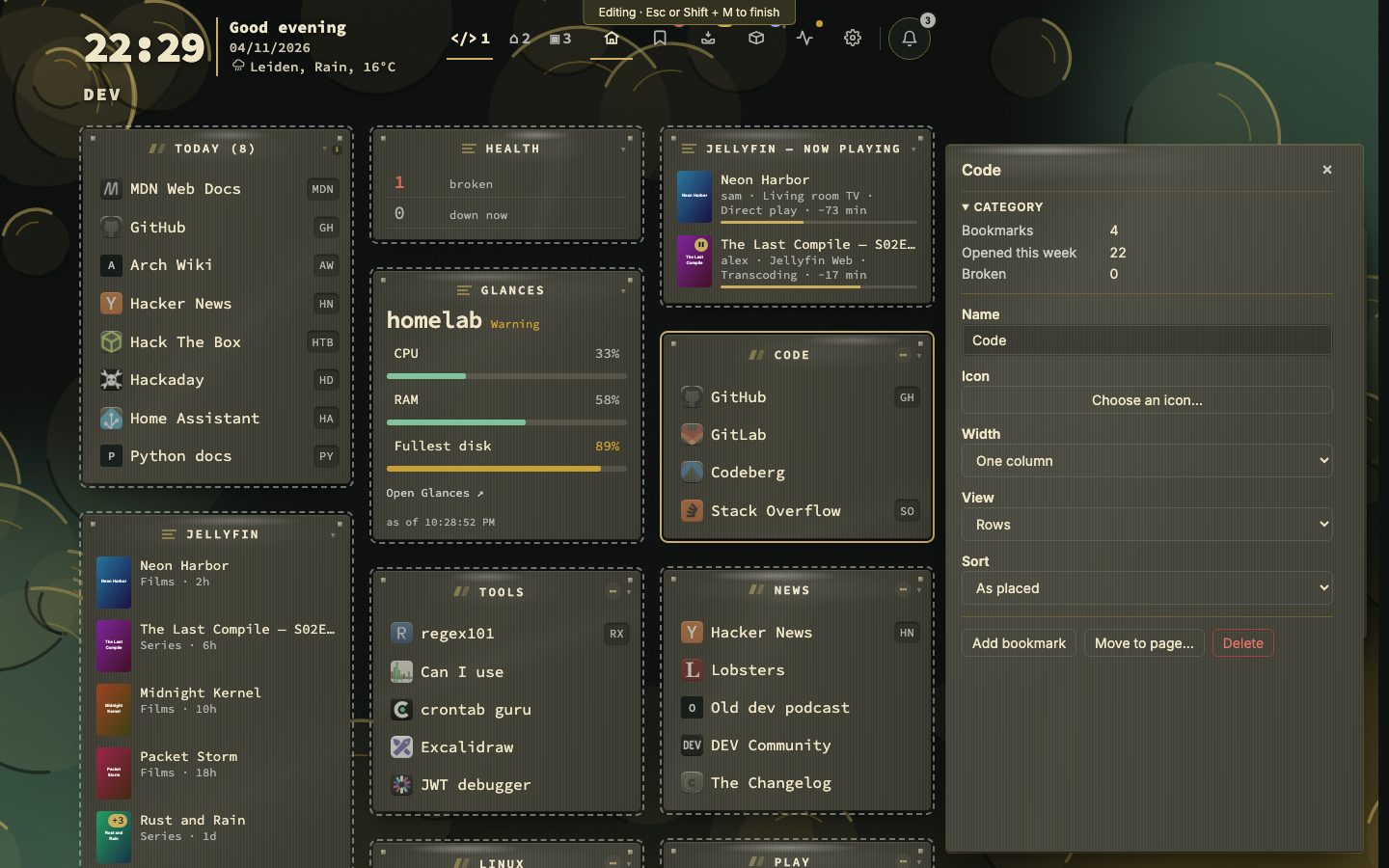
Edit mode changes the dashboard itself without a trip to config. A bar at the top says it is on. A click on a block selects it instead of opening it, and a panel opens at the right: for a category its name, icon, width, view and sorting, with buttons to add a bookmark, move it to another page or delete it; for a widget its main settings; for a page its name, emoji and colour, with buttons to add a category or delete the page. Changes are saved as you make them. Esc or Shift + E ends the mode. It is for computers and tablets with a wide window, and a phone layout never enters it.
The grid
Categories and widgets stand in as many columns as the setting allows and the window has room for, and in one column on a phone held upright. A category header shows its name, a count, its sorting and a fold arrow; click it to fold the category, or press . to fold the whole page. A bookmark row shows its icon, name, tags, shortcut and, when it is checked, its status and ping. Smart collections such as Today stand among your categories. A key legend under the grid lists the most useful keys, and Shift + H switches it off. Pages and categories has the rest of the structure.
The link preview card
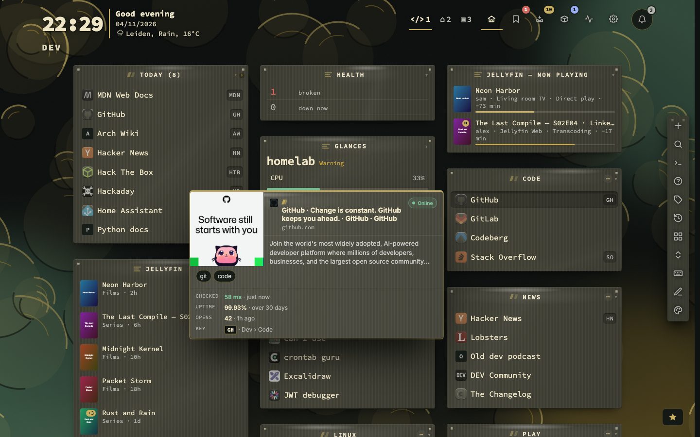
Point at a bookmark, or press v on the selected row, and a card opens. It tells what the page is (icon, title, address, status), what it says (picture, description, your note and tags) and what you know about it (last check, uptime, certificate expiry, how often you opened it, its shortcut and where it lives). A row with nothing to say is left out. A bookmark that is a video opens on its thumbnail with a play button, and nothing reaches the video site until you press it.
The picture and the site icon are fetched by your own server and stored in your data folder, so hovering never tells the site you looked. Config, then Appearance, then Previews, switches the cards off, on hover or keyboard only, and lets you pick the rows.
Related links
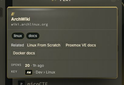
Under the tags, the preview card shows up to three of your other bookmarks that go with this one. It reads your tags, your addresses and the times you opened things together, and it counts a tag or a site for less the more of your library carries it, so a tag on a third of your bookmarks relates nothing by itself. Point at one to see why: shared tags, the same site or often opened together. Click opens it, Shift + click goes to its place on the dashboard. Related links in the right-click menu and :related in the command palette list the same links, and the row is one of the rows you can switch off under Config, Appearance, Previews.
Page tabs and the switcher in practice
The number of pages shown before the rest fold into a +N list is a setting: from 3 to 9 tabs, 4 to begin with. Show page names in tabs and Show the dashboard title sit in the same group. Nothing here changes the keys: page 7 is still 7, whether its tab is visible or inside the list.
The switcher style and the button style can also be changed without opening Config. Open the command palette with : and type one of these.
The same palette has :maxtabs for the number of tabs and :buttonstyle for plain or boxed header controls.
Edit mode, step by step
- 1Press Shift + E
- 2Click a category, a widget or a page tab
- 3Change its name, icon, width, view or sorting in the panel
- 4Press Esc, or Shift + E again, to end the mode
What the panel offers depends on what you selected. A category shows what is in it (bookmarks, opened this week, broken), then its name, icon, width, view and sorting, with buttons to add a bookmark, move it to a page and delete it. A widget shows its type and main settings, then name, width and state, with Settings… (the same sheet as Config, then Widgets, opened over the dashboard), move and delete. A page shows how many categories, bookmarks and widgets it holds, with name, emoji and colour, and buttons to add a category or delete the page.
While the mode is on, the grid’s bare letters and arrow keys are left alone and the preview card stays away, so a click can only select. Esc works from the inside out: first a dialog or menu, then a text field in the panel, and only then the mode itself. In a text field, Esc puts the old text back. A width that cannot be chosen is greyed out, and the line under it says why: spreading needs a limit on items per category, at least two columns, and a layout that is not locked.
On a phone
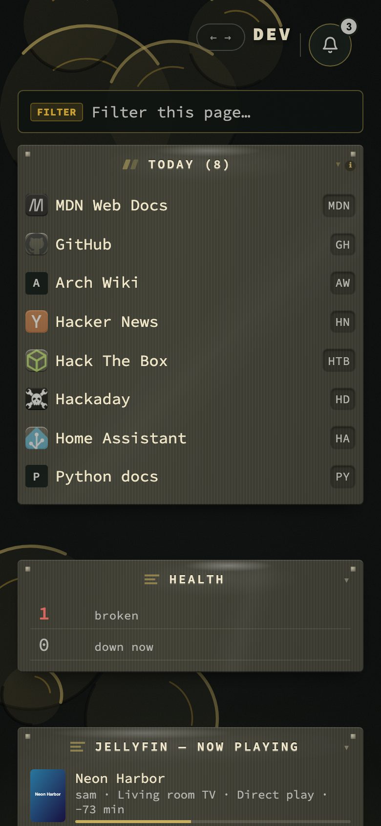
On a phone held upright the grid is one column, in the same order as on a wide screen. Edit mode is not offered, the theme studio button and the release-notes star are left out, and every category is one column wide. Everything else stays reachable: the page switcher, the destinations and the keys of an attached keyboard.
The key legend and the occasional tip
Under the grid, on the dashboard only, a legend lists the most useful keys in four lines: the cursor, finding things, going somewhere and acting on a bookmark. The keys that assume you use the keyboard appear when you first move the cursor. Shift + H switches the legend off and on, and every other view has a legend of its own.
Beside the page name a small strip says what your keys do right now: Search while you can just type, Cursor with the letters for the bookmark under the cursor, the number of ticked rows, or Edit mode. It suggests a few keys for the row you are on, among them one you have not used yet, and fades after two seconds. Shift + S switches it off and on.
Tips do not pop up over your work. Two a day wait in the notifications bell, each with a button to the place it is about, and a tip you read is gone. Config, then Behavior, then Privacy and sync, then Onboarding, has the switch for the tips and the one for the tour that a section can offer the first time you open it. Each tour is still one click away on its Tour button.
- 11action buttons
- 4switcher styles
- 2 suntil the bar slides away
The manual has the whole dashboard in chapter 4, and the views it leads to in chapter 3.