Appearance
Every setting for the look, in nine tabs, with a preview that follows along.
- < Open config, where Appearance lives
Config, then Appearance, holds everything about how the dashboard looks. Nine tabs stand under three labels: Look (theme, background, surfaces), Bookmarks (layout, rows, link previews) and Header and bars (header, action bar, date and weather).
On each tab the first panel is open. The others fold to one line that says what they are set to, with changed values first. Beside the settings stands a small drawing of your dashboard, which follows every change as you make it.
Try it
- Open Config and choose Appearance.
- Pick a tab, for example Background, and change a setting. The preview and the dashboard follow at once.
- Fold a panel open to see all of its settings.
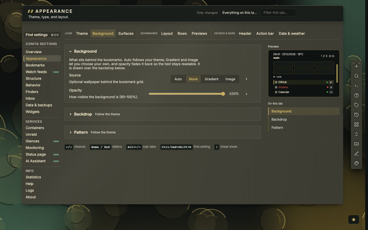
Find what you changed
Only changed keeps the settings that differ from the default, and the line above the tabs counts them. The filter finds a setting by name, and every panel can be reset on its own.
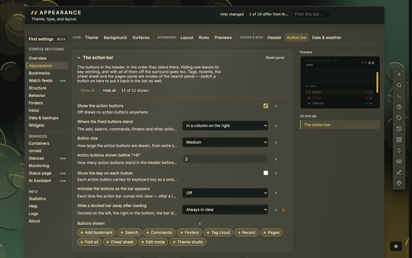
Two typefaces
The header bar, the bookmark grid and the search panel are set in the typeface you pick under Appearance, Source Code Pro to begin with. Config, the inbox, the tag and container views and the dialogs read in Inter. Pick another typeface, or apply a look that names one, and the dashboard follows.
Material style, and a quiet centre
Under Surfaces, Material style picks how each material is drawn: with its own signature, or Classic and flat. Quiet centre fades the backdrop behind the bookmarks so the links stay easy to read. Both can be set for one theme and left alone for the others.
Nine tabs in three groups
- 9tabs
- 3groups
- Look: Theme, Background and Surfaces.
- Bookmarks: Layout, Rows and Previews.
- Header & bars: Header, Action bar and Date & weather.
Config opens Appearance on the tab you had open if that was in the last five minutes, and on Theme otherwise. Every setting has a short line under it that says what it does. A narrow window wraps the tab strip instead of scrolling it, so every tab stays on screen down to phone width. Old links still work: /#config/appearance/grid opens Layout and /#config/appearance/look opens Theme.
Background, in three layers
Everything behind the bookmarks is on the Background tab, and it is drawn in three layers from the bottom up: the backdrop of the theme, a pattern over it, and a background of your own on top.
- Source is Auto (follows the theme), None, Gradient or Image. Opacity goes from 65 to 100 percent, so the bookmarks stay readable.
- Theme backdrop is Follow the theme, Choose one or Off. Every theme draws a backdrop in its own colours.
- Pattern is Follow the theme, Dots, Grid, Lines, Hatch or None: a texture drawn over the backdrop.
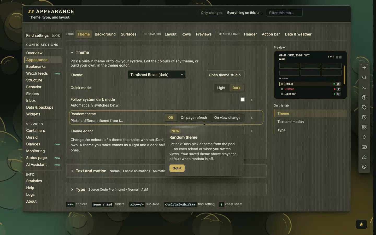
Many of these settings also have a command in the command palette, for example :backdrop, :pattern, :depth, :glow and :contrast.
Layout, rows and previews
The Layout tab sets the shape of the grid: columns per row (1 to 6), a layout preset (Default, Compact, Cards, Terminal-ish, Masonry, List, Widgets or Launcher), the density, and the room between categories, between columns and at the page margins. Items per category is 10 to 50 or Unlimited, and decides how many bookmarks show before + N more. Small drawings beside the shape settings show what a value looks like.
The Rows tab holds favicons, the category header (Clean, Underlined, Boxed, Label or Group card, in three sizes) and what a bookmark row shows: tags, status chips and the shortcut letters, which can be always on, only on the row you are on, or never. The Previews tab turns the link preview card Off, On hover or Keyboard only, sets the hover delay and lets you choose, with chips, what the card shows.
- 1Open Config, then Appearance
- 2Pick the Layout tab
- 3Change Columns per row or Layout preset
- 4Watch the preview and the dashboard follow
- 5Press Reset panel to undo the whole group
Header, action bar, date and weather
The Header tab sets the button style, the page tabs, the dashboard title and the browser tab title and icon. The Action bar tab starts with Show the action buttons, since that decides whether the rest matters. Below it are where the bar stands, the button size, whether each button shows its key, and one chip per button. Date & weather sets where the clock and weather stand, the date format, 12 or 24 hours, the weather location (a city you type or automatic by IP address) and Celsius or Fahrenheit.
A large clock, and a greeting
On Date & weather, Clock and weather has a fourth placement, Large clock, greeting beside it: the time drawn large, with a greeting that follows the hour (Good evening, Jordi). Your name, in the Greeting group, is the name in it; leave it empty for a greeting without one.