Looks
since v1.16 · 2 Oct
Pick a look, tweak it, and make it yours.
See every theme on a real dashboard in the theme gallery →
- < Open config, where Appearance lives
A look changes how the whole start page feels: colours, surfaces, density and mood. nextDash ships with a collection to start from, and the look studio lets you adjust one and save it as your own.
Changes apply live, so you see the result while you tweak.
Try it
- Press Shift + A to open the theme studio.
- Pick a look and watch the page change.
- Adjust it there and save your version.
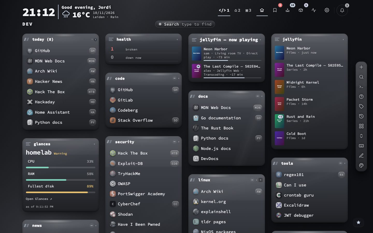
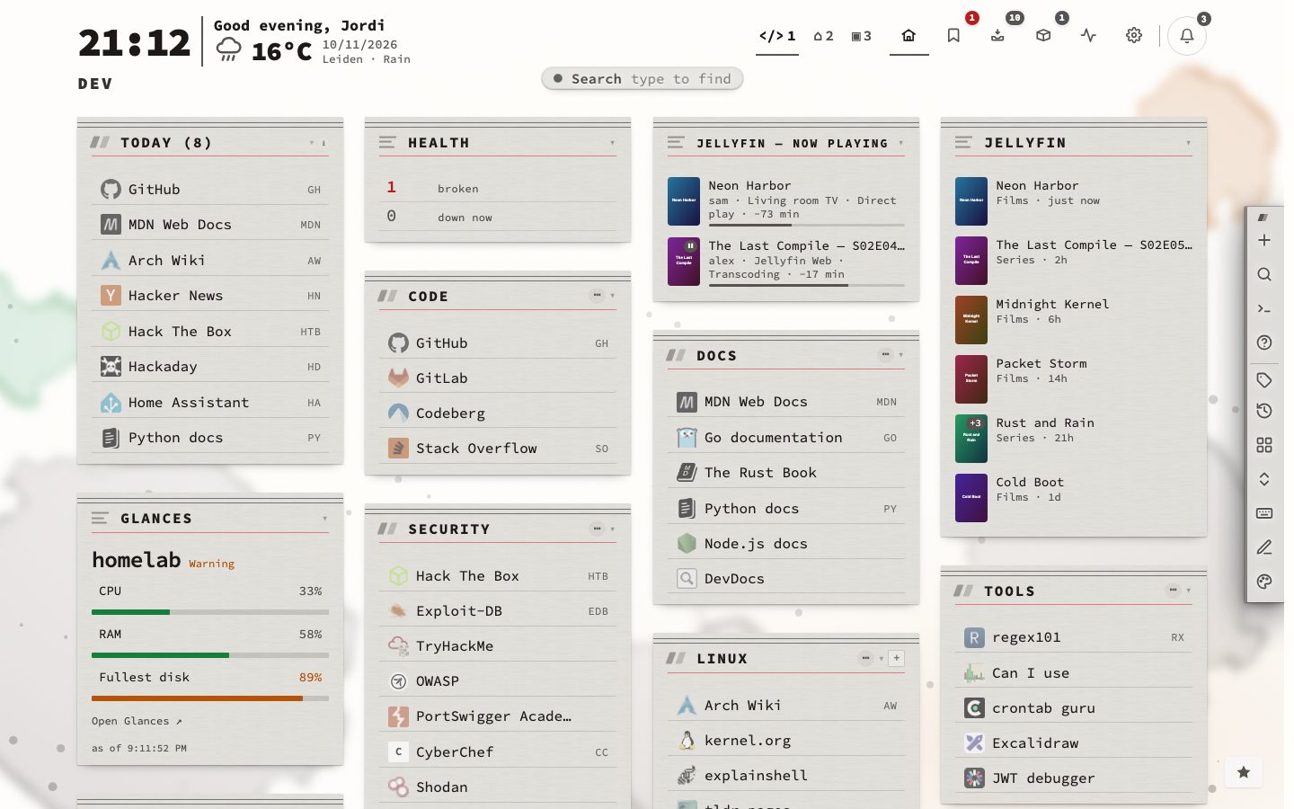
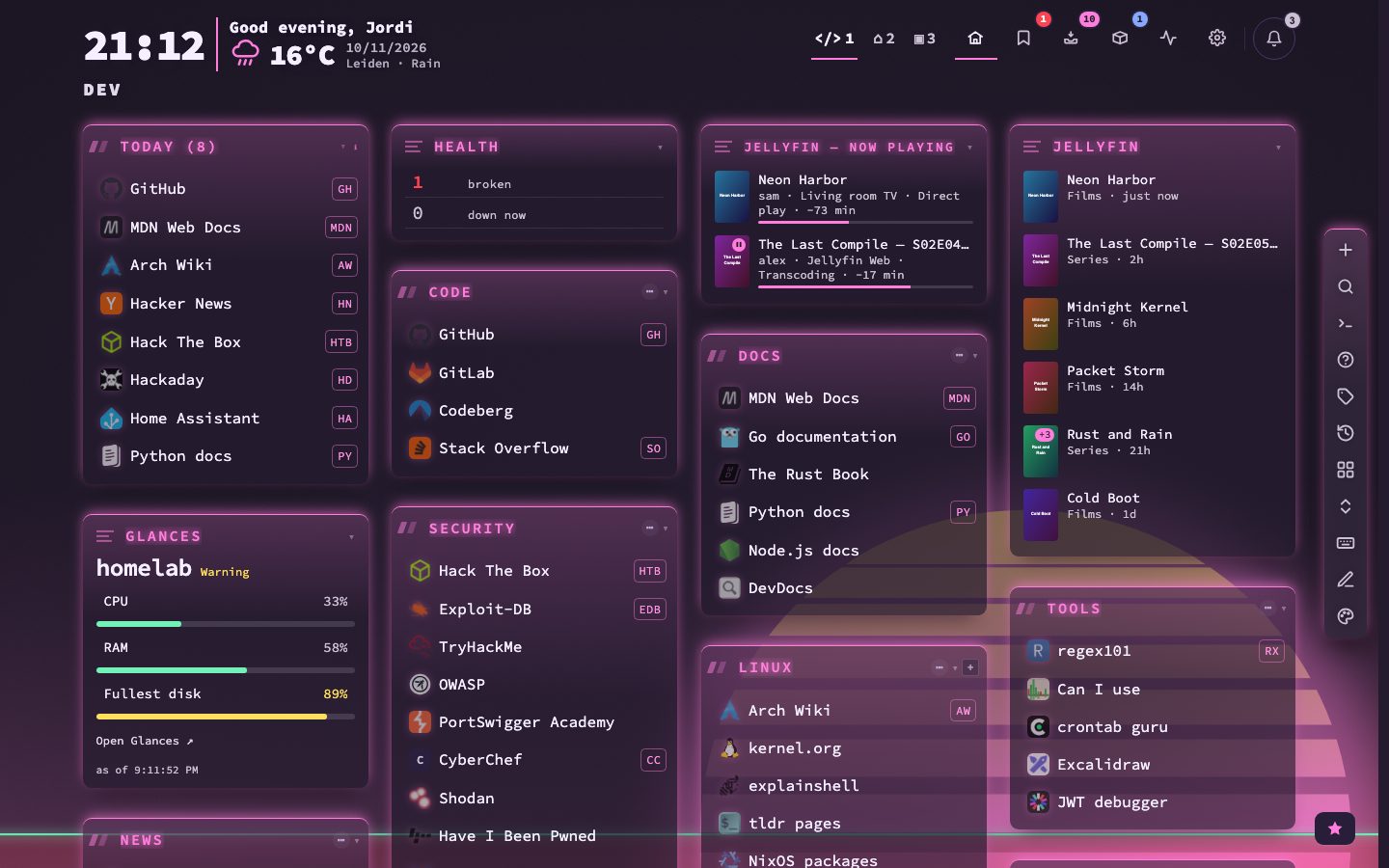
Signature or Classic
A look is built on a material. Under Material style in the theme studio each material is drawn with its own signature, or in the flat Classic way, and a Quiet centre slider calms the backdrop behind the bookmarks. Your look follows whichever you choose.
The twelve looks
- 12looks
- 6studio tabs
- Glass: a photo-like sunset backdrop, glass cards and clean headers.
- Glass boxed: mountains, boxed headers and a little more blur.
- Frosted: bokeh, lots of blur and see-through cards.
- Aurora: northern light behind clear glass.
- Night sky: stars on a darkened page and quiet labels.
- Soft: a blurred wash of colour and calm cards.
- Desert: warm dunes tinted by the theme, with counts.
- Paper: contour lines, near-solid cards and an underline in the accent colour.
- Blueprint: a drafting grid, edged cards and boxed headers.
- Terminal: scanlines, solid cards and bare labels.
- Neon: bright prisms, see-through cards and group cards.
- Plain: no backdrop, solid cards and label headers.
What a look sets, and what it leaves alone
A look sets the backdrop, the surface, the headers and the type in one go. It leaves the colours of your theme alone, so the same look reads differently on a dark theme and on a light one. After you use a look, every part can still be tuned in its own tab of the studio. The Use button on a look shows it on the page at once, and nothing is kept until you press Apply.
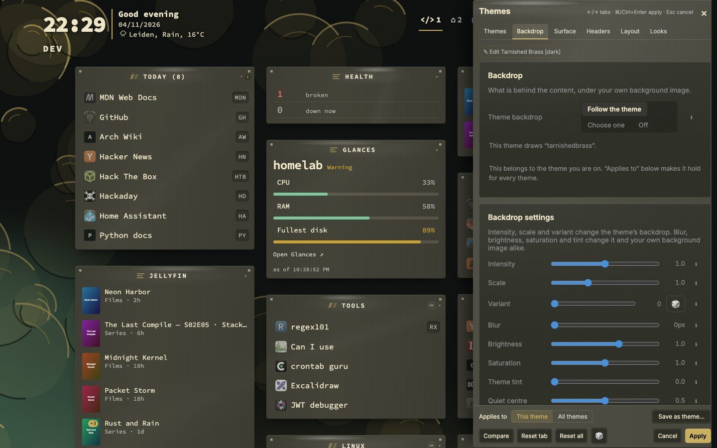
- 1Press Shift + A to open the theme studio
- 2Open the Looks tab
- 3Press Use on a look to see it on the page
- 4Fine-tune it in the Backdrop, Surface, Headers or Layout tab
- 5Press Apply, or Save as theme to keep it as your own
Keep a look with your own theme
A theme of your own can bring a look along. In the theme editor, Take the look on screen stores what you see, and Clear removes it. Both halves of a theme pair share the look. Save as theme in the studio turns what is on screen into a new theme, with a switch called Bring this look along. Picking that theme, from a card, the Theme picker or :theme, applies its look. Above the grid, Use this theme’s look lets you turn that off, so that picking such a theme leaves the look on screen as it is.