nextDash v1.29.0 — a tab bar and a Status screen for the phone
nextDash v1.29.0 gives the phone its own way around the dashboard. A tab bar replaces the footer, a Status screen shows what is up and what is down, and a press and hold opens a short menu. Two more additions apply everywhere: blocks that show on one kind of screen only, and list view columns you can resize.
A tab bar on the phone
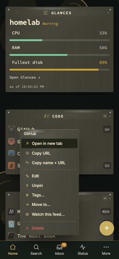
In the phone layout the bottom bar now has Home, Search, Inbox, Status and More. Inbox shows the unread count. Status shows how many services are down or failing their check. A round + button on the grid keeps the old route to add a bookmark. Tablets and desktops are unchanged.
Two start screens
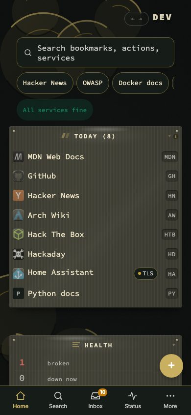
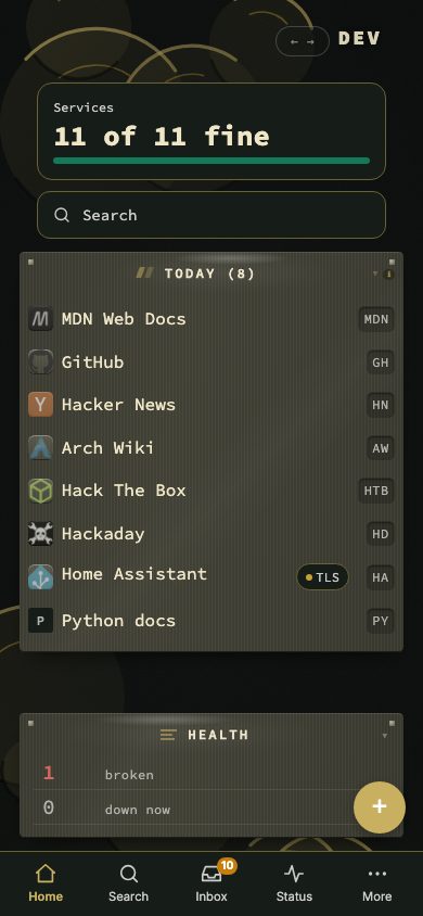
Home opens with a big search field and one status line, or with an is everything fine? card and search below it. Pick one in More. The choice is stored per device, so a phone and a desktop can differ.
Status, with a pause
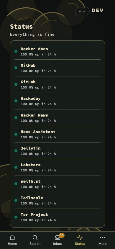
The Status screen lists every monitored bookmark. Green is up, amber is a certificate that expires within 14 days, red is down. It also pauses notifications for one hour or until 07:00 tomorrow. The server holds alerts while paused, like quiet hours, and sums them up afterwards. Anything allowed under Always let through still arrives. Config → Notifications shows a running pause with a Resume now button.
Search sheet and short menu
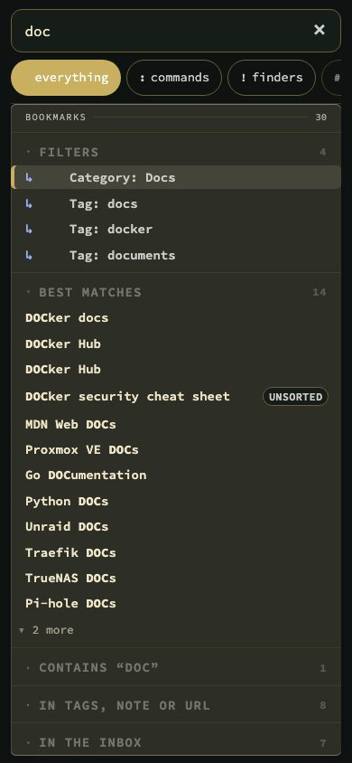
The Search tab opens a full-screen sheet with a real field, the modes as a row of chips and larger result rows. It has a close button, because a phone has no Escape. Typing in it searches bookmark names, and letters that match a shortcut no longer open a bookmark on the way to a longer word.
A press and hold on a bookmark now opens a short menu on the grid, in the Inbox and on Status: open in a new tab, copy, share, edit, pin, tags, move, watch the feed and delete. Before, a long press opened the inline editor and iOS never delivered the context menu.
More, forms and the Inbox
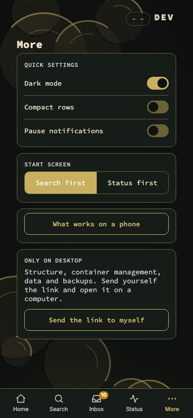
More holds dark mode, compact rows, the pause, the start screen choice and a phone guide that lists what works on a phone and what needs a desktop. The bookmark forms are full screens with Cancel, Save and Delete fixed at the bottom. Fields are 48px high with 16px text, so iOS no longer zooms in on focus. The Inbox gets 44px targets.
Show on, and resizable columns
Categories, widgets and collections have a Show on choice: everywhere, desktop only or phone only. It sits in the edit panel, in the ⋯ menu and in a column in Config → Structure. In edit mode a hidden block stays on the grid, dimmed and labelled.
In the list views of Bookmarks, Tags, Inbox and Containers, drag a column border to resize it. Double-click a handle, or press Delete on it, to reset. Widths are kept per view on the device.
Smaller changes
- Adding a feed with Watch this feed… now fetches the ten newest posts and opens a popover on the bookmark.
- The quick start waits for a desktop. On a phone, Home says to run it once on a computer.
- A one-time hint says that a swipe changes page.
- The phone strings are now in all six languages.
Upgrading
docker pull ghcr.io/jordibrouwer/nextdash:latest
# or
docker pull foobar1452/nextdash:latest
On Unraid, update the container from the Docker tab. Full notes are in the GitHub Release.